Uranium is rising again, these ASX uranium stocks have the best charts
Sprott's oversubscribed capital raising to purchase physical uranium has spiked ASX uranium stocks, these are best charts in the sector.


Source: Shutterstock, Market Index
Mentioned
KEY POINTS
- Sprott's oversubscribed capital raising to purchase physical uranium triggered a sharp increased in the uranium spot price on Monday.
- Several ASX listed uranium stocks have seen similar strong gains this week, but not all of them have moved into strong uptrends on their charts.
- We review over 25 ASX uranium stocks, from explorers to producers, to find the strongest uptrends in the sector.
Yesterday, I covered a major development in the uranium market, Monday’s announcement by Sprott that it would raise US$200 million via its Sprott Physical Uranium Trust (SPUT) to purchase physical uranium on the spot market. The announcement sent the spot uranium price soaring, and with it, the share prices of several ASX listed uranium stocks.
In that article, I also discussed the latest demand and supply dynamics of the uranium market, including on the demand side:
The growing nuclear reactor fleet
Similarly growing strategic interest in fostering nuclear energy by governments
Increasing involvement from major tech corporations looking to secure cheap and reliable energy for their burgeoning data centre and AI applications.
And on the supply side:
Constrained production due to years of underinvestment
Recent production challenges such as operational issues and critical chemical supply shortages.
Today’ I’ll be dispensing with the fundamentals – quite happily too – as many of you likely know my preference for technical analysis and technical analysis alone! I’ve checked the charts of over 25 ASX uranium stocks, from explorers, to developers, to producers, and have come up with a shortlist of 8 stocks that are showing either improving or strong signs of excess demand (i.e., D > S = P ⬆️!). There are two others to round out the main list that would be considered "majors" by ASX standards – but aren’t quite there yet – and it would be remiss of me not to cover!
I’ll do them in alphabetical order. Here’s the main list for your reference, and note that I’ll discuss the state of “the rest” of the sector at the end (i.e., should your favourite not be listed below!):
Alligator Energy (ASX: AGE)
Aura Energy (ASX: AEE)
Bannerman Energy (ASX: BMN)
Berkeley Energia (ASX: BKY)
Boss Energy (ASX: BOE)
Deep Yellow (ASX: DYL)
Elevate Uranium (ASX: EL8)
Nexgen Energy (ASX: NXG)
Paladin Energy (ASX: PDN)
Silex Systems (ASX: SLX)
First up, the reason for all chart analysis stopping on 17 June is thus: I only analyse closed candles. So, today's candle is live, and therefore my model discounts it. Also, you can find links to explanations of the terms I use in my analysis at the bottom of the article, they are assumed knowledge for now!
Emoji Legend:
✅ meets demand-side criteria
✅✅ strong demand-side control indication
❌ doesn't meet demand-side criteria
↔️ neutral indication
⌛ waiting for something to occur.
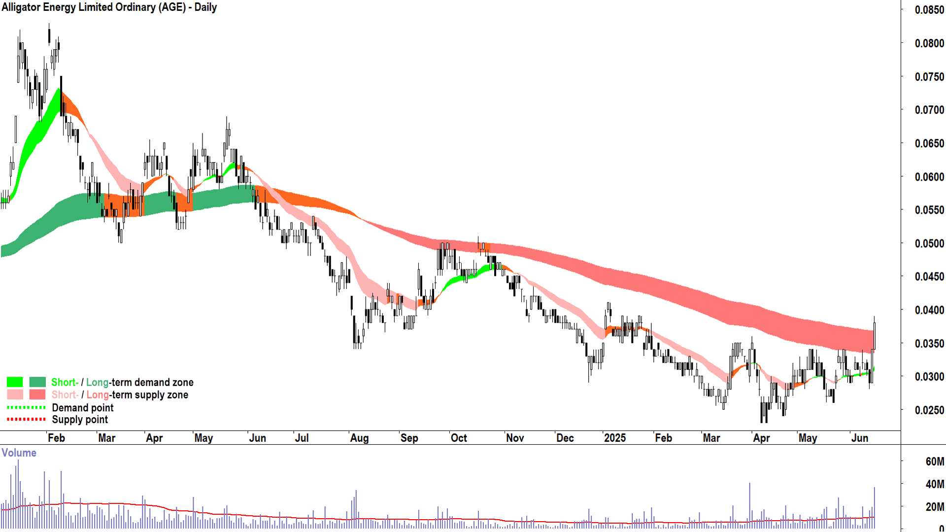
Alligator Energy (AGE)
%20daily%20chart%2017%20June%202025.png)
Alligator Energy (ASX-AGE) daily chart (as at 17 June 2025) (click here for full size image)
Trends
AGE is showing a short term uptrend and a long term downtrend. This indicates the demand and supply for the company's shares growing more balanced, but that the supply-side likely remains in control overall ↔️
The short term uptrend ribbon is acting as a zone of dynamic demand ✅
The price has closed above the long term uptrend ribbon ✅ and should we see a trough formed at or above the ribbon, and should that ribbon transition to at least neutral (amber), it will signal the start of a new long term uptrend ⌛
Price Action
The price action is rising peaks and falling troughs ↔️
Candles
The candles are predominantly demand-side in nature ✅
Comment
My technical model suggests improving demand-side control here, but given the long term downtrend remains intact, caution is warranted ↔️
Also, the choppy nature of the price action (compressed/overlapping peaks and troughs) could be better (i.e., greater separation 📈) ↔️
A point of demand / trough set above the long term trend ribbon would further confirm demand-side control, transition the price action to rising peaks and rising troughs, and assuming continued strong price action and candles, would set up AGE for potential continued upside ⌛
Conclusion: Still early to add risk here as per my model, but definitely improving ⌛
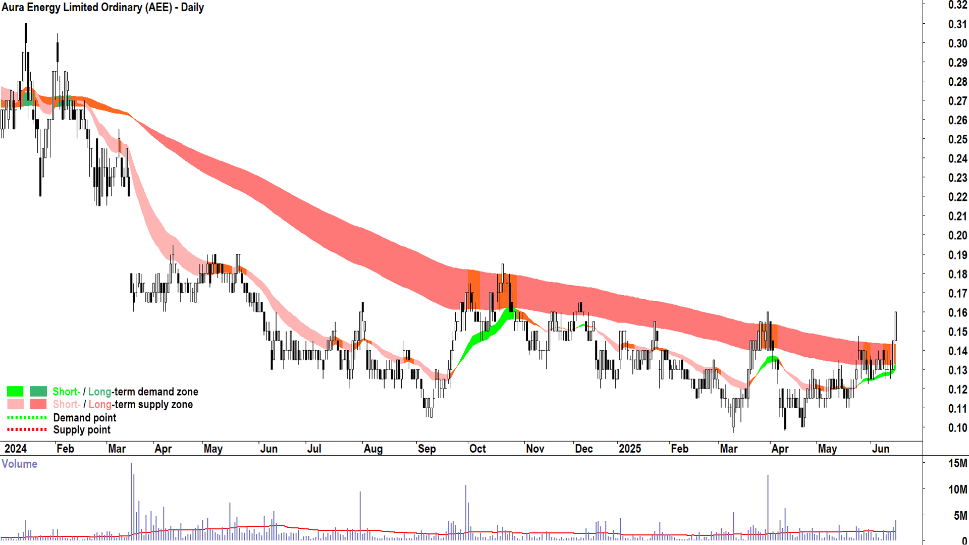
Aura Energy (AEE)
%20daily%20chart%2017%20June%202025.png)
Aura Energy (ASX-AEE) daily chart (as at 17 June 2025) (click here for full size image)
Trends
AEE is showing a short term uptrend and a neutral long term trend. This indicates the demand and supply for the company's shares is fairly balanced ↔️
The short term uptrend ribbon is acting as a zone of dynamic demand ✅
The price has closed above the long term uptrend ribbon ✅ and should we see a trough formed at or above the ribbon, it will signal the start of a new long term uptrend ⌛
Price Action
The price action is rising peaks and rising troughs ✅
Candles
The candles are predominantly demand-side in nature (i.e., white-bodied and or downward pointing shadows) ✅
Comment
My technical model suggests improving demand-side control here, but the flat nature of the price action (compressed / overlapping peaks and troughs) indicates only modest excess demand ↔️
A point of demand / trough set above the long term trend ribbon would further confirm demand-side control, and assuming continued strong price action and candles, would set up AEE for potential continued upside ⌛
Conclusion: Still early to add risk here as per my model, but definitely improving ⌛
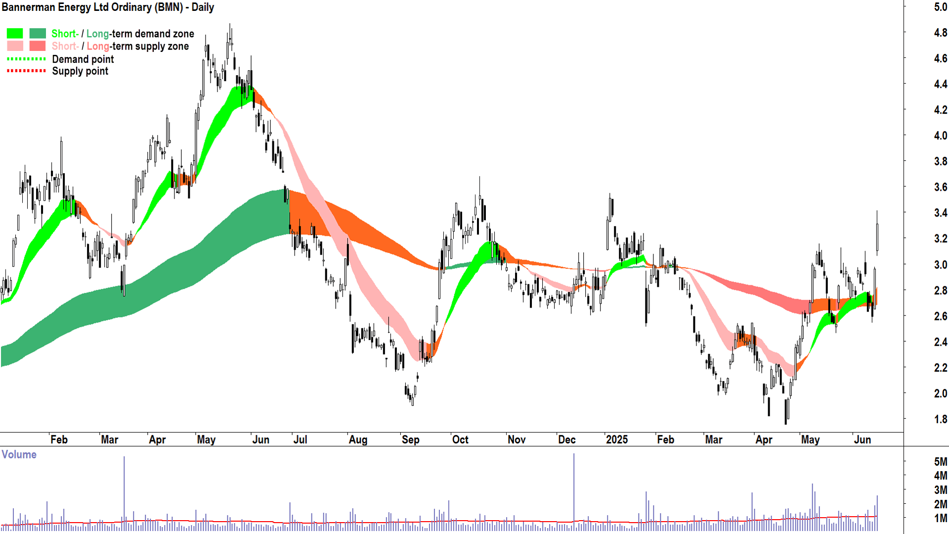
Bannerman Energy (BMN)
%20daily%20chart%2017%20June%202025.png)
Bannerman Energy (ASX-BMN) daily chart (as at 17 June 2025) (click here for full size image)
Trends
BMN is showing a short term uptrend and a long term uptrend (i.e., the long term trend ribbon is not down (dark pink) and a trough has formed at or above the long term trend ribbon indicating it has transitioned to a zone of excess demand) ✅
The short term uptrend ribbon is acting as a zone of dynamic demand ✅
The long term uptrend ribbon is acting as a zone of dynamic demand ✅
Price Action
The price action is falling peaks and rising troughs ↔️
Candles
The candles are predominantly demand-side in nature, particularly the last two, which are very strong demand-side control indications ✅ ✅
Comment
My technical model suggests demand-side control here, and a new long term uptrend has commenced ✅
Ideally, the price action moves back to rising peaks and rising troughs, but the strong indication from the last two candles makes up for this ✅
Conclusion: My model is happy to hold/add risk here ✅
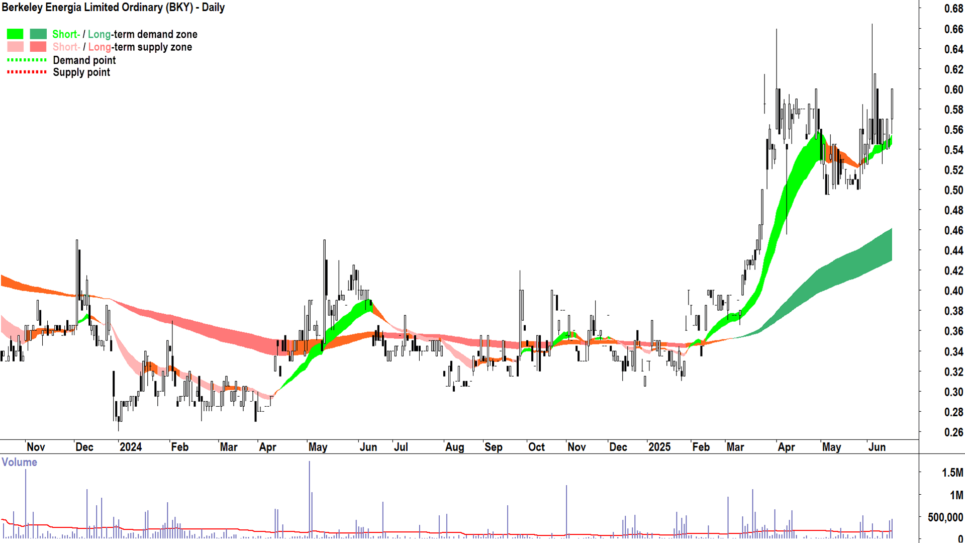
Berkeley Energia (BKY)
%20daily%20chart%2017%20June%202025.png)
Berkeley Energia (ASX-BKY) daily chart (as at 17 June 2025) (click here for full size image)
Trends
BKY is showing a short term uptrend and a long term uptrend ✅✅
The short term uptrend ribbon is acting as a zone of dynamic demand ✅
The long term uptrend ribbon is acting as a zone of dynamic demand ✅
Price Action
The price action is rising peaks and rising troughs, but is somewhat compressed very recently, likely due to the influence of the $0.66 point of supply ↔️
Candles
The candles are predominantly demand-side in nature ✅
Comment
My technical model suggests demand-side control here, but some influence is being exerted by the $0.66 point of supply, this is not unexpected, however ✅
Ideally, we see a strong demand-side candle that closes near / above $0.66 to indicate the excess supply there has been consumed ⌛
Conclusion: My model is happy to hold/add risk here, but I question the liquidity of the stock ✅🤔
Boss Energy (BOE)
%20daily%20chart%2017%20June%202025.png)
Boss Energy (ASX-BOE) daily chart (as at 17 June 2025) (click here for full size image)
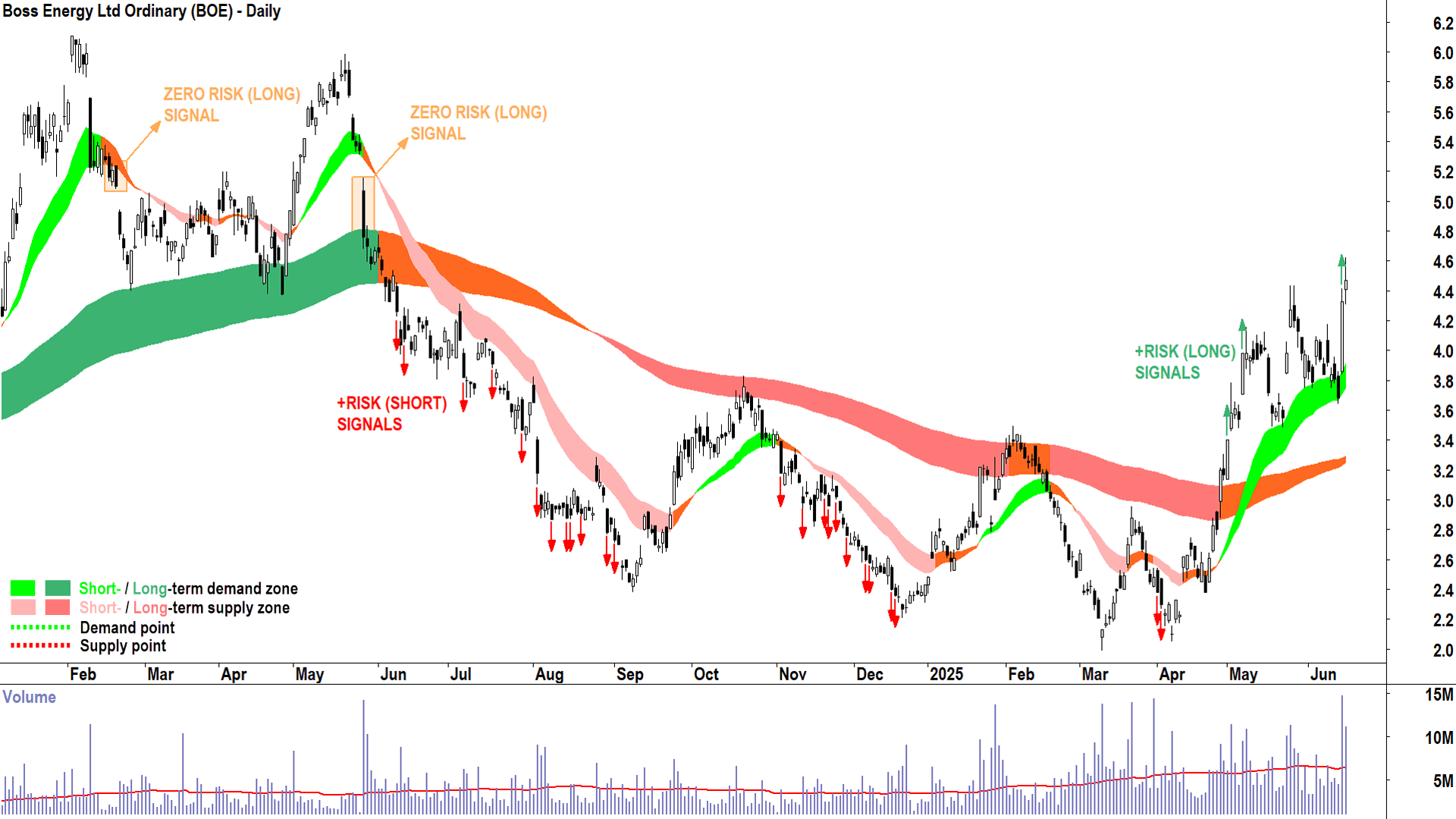
Trends
BOE is showing a short term uptrend and a long term uptrend (i.e., the long term trend ribbon is not down (dark pink) and a trough has formed at or above the long term trend ribbon indicating it has transitioned to a zone of excess demand) ✅
The short term uptrend ribbon is well established, and is acting as a zone of dynamic demand ✅✅
The long term uptrend ribbon is acting as a zone of dynamic demand ✅
Price Action
The price action is rising peaks and falling troughs, but given the large gain on 16-June, the next trough is likely to be higher than the last trough. Still, would like to see some improvement here ↔️
Candles
The candles prior to 16-June were mixed, but the 16-June candle is an indication of strong demand-side control – enough for me to conclude the demand-side is indeed in control here ✅
Comment
My technical model suggests demand-side control here, the 16-June candle has righted the ship, so to speak ✅
BOE has appeared as a Feature Uptrend Chart (highest conviction) on 1-May, 7-May, and as recently as 16-June
Conclusion: My model is happy to hold/add risk here ✅
Deep Yellow (DYL)
%20daily%20chart%2017%20June%202025.png)
Deep Yellow (ASX-DYL) daily chart (as at 17 June 2025) (click here for full size image)
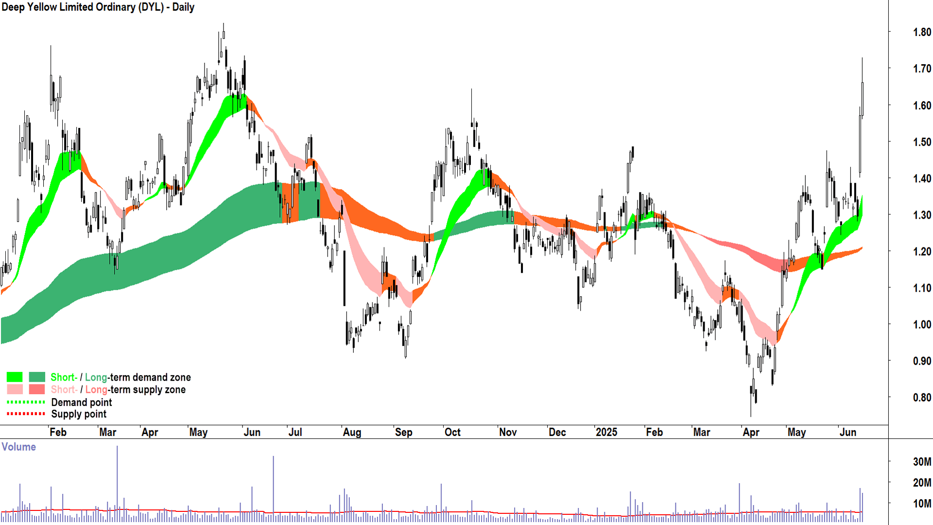
Trends
DYL is showing a short term uptrend and a long term uptrend (i.e., the long term trend ribbon is not down (dark pink) and a trough has formed at or above the long term trend ribbon indicating it has transitioned to a zone of excess demand) ✅
The short term uptrend ribbon is well established, and is acting as a zone of dynamic demand ✅✅
The long term uptrend ribbon is acting as a zone of dynamic demand ✅
Price Action
The price action is rising peaks and falling troughs, but given the large gain on 16-June, the next trough is likely to be higher than the last trough. Still, would like to see some improvement here ↔️
Candles
The candles prior to 16-June were mixed, but the 16-June candle is an indication of strong demand-side control – enough for me to conclude the demand-side is indeed in control here ✅
Comment
My technical model suggests demand-side control here, the 16-June candle has righted the ship, so to speak ✅
DYL has appeared as a Feature Uptrend Chart on 8-May and as recently as 16-June
Conclusion: My model is happy to hold/add risk here ✅
Elevate Uranium (EL8)
%20daily%20chart%2017%20June%202025.png)
Elevate Uranium (ASX-EL8) daily chart (as at 17 June 2025) (click here for full size image)
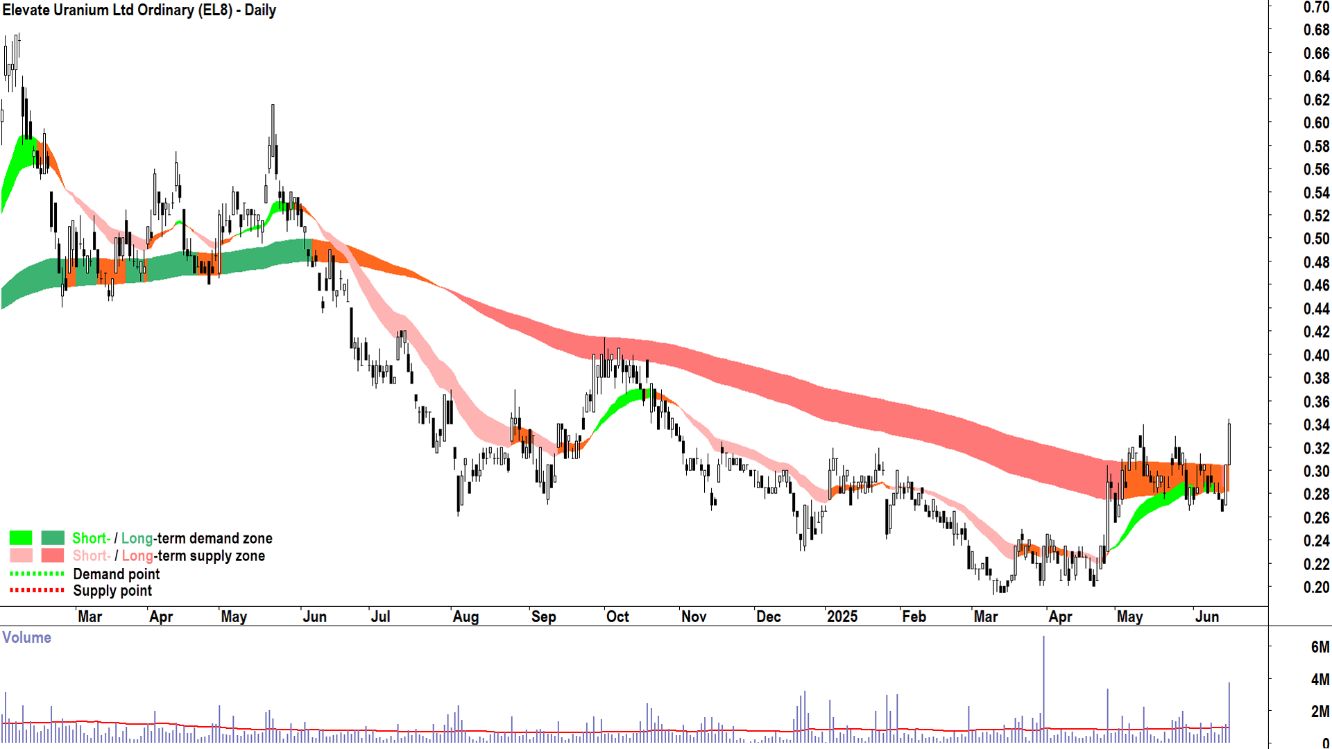
Trends
EL8 is showing a short term uptrend and a neutral long term uptrend ↔️
The short term uptrend ribbon is acting as a zone of dynamic demand ✅
The price has closed above the long term uptrend ribbon ✅ and should we see a trough formed at or above the ribbon, it will signal the start of a new long term uptrend ⌛
Price Action
The price action is rising peaks and falling troughs, but given the large gain on 17-June, the next trough is likely to be higher than the last trough. Still, would like to see some improvement here ↔️
Candles
The candles prior to 16-June were mixed, but the 16 & 17-June candles are an indication of strong demand-side control – enough for me to conclude the demand-side is indeed in control here ✅
Comment
My technical model suggests demand-side control here, the 16 & 17-June candles has righted the ship, so to speak ✅
EL8 appeared as a Feature Uptrend Chart for the first time yesterday, 16-June, but given it is still yet to confirm a new long term uptrend via a trough set at/above the long term trend ribbon – it is considered an aggressive setup
Conclusion: My model is happy to hold/add risk here ✅
Nexgen Energy (NXG)
%20daily%20chart%2017%20June%202025.png)
Nexgen Energy (ASX-NXG) daily chart (as at 17 June 2025) (click here for full size image)
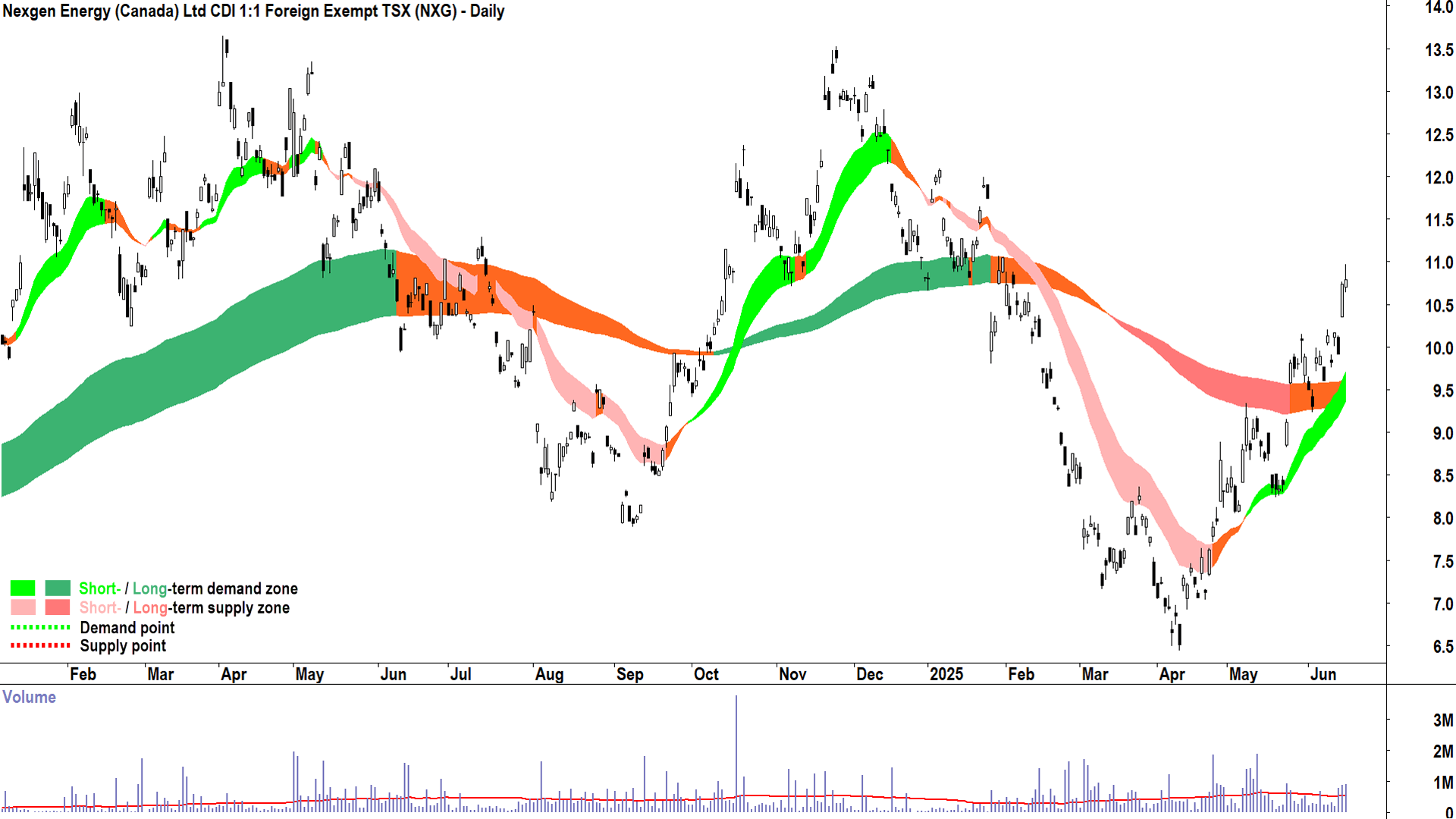
Trends
NXG is showing a short term uptrend and a long term uptrend (i.e., the long term trend ribbon is not down (dark pink) and a trough has formed at or above the long term trend ribbon indicating it has transitioned to a zone of excess demand) ✅
The short term uptrend ribbon is well established, and is acting as a zone of dynamic demand ✅✅
The long term uptrend ribbon is acting as a zone of dynamic demand ✅
Price Action
The price action is rising peaks and rising troughs ✅
Candles
The candles are predominantly demand-side in nature, the particularly solid sowing on 16-June confirms strong demand-side control here ✅✅
Comment
My technical model suggests strong demand-side control here ✅✅
DYL has appeared as a Feature Uptrend Chart on 12-June and as recently as 16-June
Conclusion: My model is happy to hold/add risk here ✅✅
Paladin Energy (PDN)
%20daily%20chart%2017%20June%202025.png)
Paladin Energy (ASX-PDN) daily chart (as at 17 June 2025) (click here for full size image)
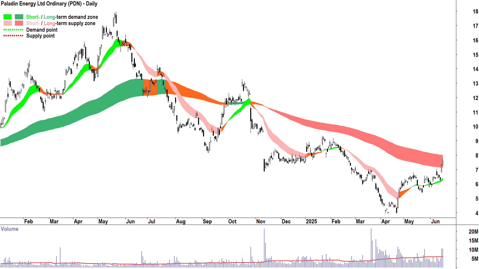
Trends
PDN is showing a short term uptrend and a long term downtrend. This indicates the demand and supply for the company's shares growing more balanced, but that the supply-side likely remains in control overall ↔️
The short term uptrend ribbon is acting as a zone of dynamic demand ✅
The price is still below the long term uptrend ribbon, and the ribbon continues to act as a potential zone of excess supply ❌
Price Action
The price action is rising peaks and rising troughs ✅
Candles
The candles are predominantly demand-side in nature ✅
The candle on 16-June is a particularly strong demand-side indication ✅✅
Comment
My technical model suggests improving demand-side control here, but given the long term downtrend remains intact, caution is warranted ↔️
The PDN price must close above the long term downtrend ribbon, the ribbon must transition to at least neutral and a point of demand must be set above the the ribbon to transition the long term trend back to up, and therefore be a candidate for a long setup as per my model ⌛
Conclusion: Still early to add risk here as per my model, but definitely improving ⌛
Silex Systems (SLX)
%20daily%20chart%2017%20June%202025.png)
Silex Systems (ASX-SLX) daily chart (as at 17 June 2025) (click here for full size image)
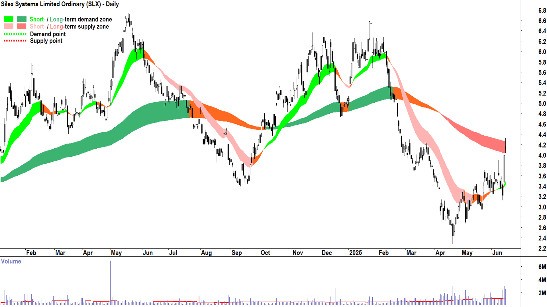
Trends
SLX is showing a short term uptrend and a long term downtrend. This indicates the demand and supply for the company's shares growing more balanced, but that the supply-side likely remains in control overall ↔️
The short term uptrend ribbon is acting as a zone of dynamic demand ✅
The price is still below the long term uptrend ribbon, and the ribbon continues to act as a potential zone of excess supply ❌
Price Action
The price action is rising peaks and falling troughs, but given the large gain on 16-June, the next trough is likely to be higher than the last trough. Still, would like to see some improvement here ↔️
Candles
The candles are mixed ↔️, but I note the particularly strong demand-side candle on 16-June ✅
Comment
My technical model suggests improving demand-side control here, but given the long term downtrend remains intact, caution is warranted ↔️
The SLX price must close above the long term downtrend ribbon, the ribbon must transition to at least neutral and a point of demand must be set above the the ribbon to transition the long term trend back to up, and therefore be a candidate for a long setup as per my model ⌛
Conclusion: Still early to add risk here as per my model, but definitely improving ⌛
The rest…
As for the rest, e.g. (tickers only) BSN, CXU, DEV, EME, GLA, GTR, LAM, MEU, NFL, T92, THR etc. their charts are generally variations on the "still plenty of excess supply" theme. Peninsula Energy (ASX: PEN) is a worthy case study in this regard.
%20daily%20chart%2017%20June%202025.png)
Peninsula Energy (ASX-PEN) daily chart (as at 17 June 2025) (click here for full size image)
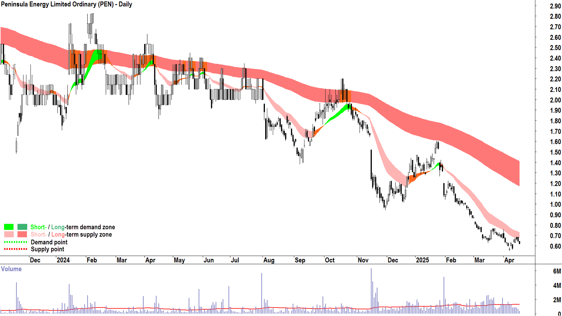
My model has absolutely no interest in these types of charts. Lotus Resources (ASX: LOT) is another popular ASX uranium hopeful, I would put its technicals in with the PDN and SLX camp – some improvement – but plenty more required.
%20daily%20chart%2017%20June%202025.png)
Lotus Resources (ASX-LOT) daily chart (as at 17 June 2025) (click here for full size image)
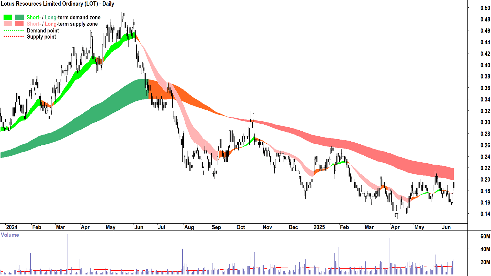
The exceptions, as in, they're more sideways than either up or down, include Aurora Energy Metals (ASX: 1AE) and Haranga Resources (ASX: HAR). Sideways for me might as well be down – again, no interest here yet.
In all cases, however, remember that both demand and supply are constantly changing. This means so too is the balance / imbalance between them, and therefore the trends, price action, and candles on the charts. The charts of any of the ASX uranium stocks discussed here could change for the better or worse, and my analysis – and yours – must be ongoing.
I trust this has been a useful sojourn through the technicals of the ASX uranium sector. To stay abreast of my other technical analysis update, please check out the links below.
Want to know more about Carl's technical analysis? Be sure to read his Technical analysis for beginners: ChartWatch primer and read his ChartWatch ASX Scans articles which are published daily and include his favourite ASX uptrends and downtrends.
