ChartWatch Markets: Nasdaq extends record run, Silver and Gold flex again, is the new Uranium bull market confirmed?
Technical analysis of the most important global stock indices, commodities, bonds, FX, and crypto impacting your ASX portfolio each day.

Source: Shutterstock
Mentioned
KEY POINTS
- The Nasdaq Composite’s record breaking run continues – despite continued cries of overvaluation! Surely the top is near?
- Silver and gold have both rallied to probe new highs in their respective latest runs, but silver is approaching a critical point of supply.
- Uranium continues to show signs of a fledgling new bull market… but can we now make the call “official”?
Welcome to the "First Edition" of ChartWatch Markets! Why the quotes? 🤔
Well, because ChartWatch has been analysing global stock, bond, commodity, FX, and crypto markets for years now in our Evening Wrap. But, after some careful consideration, the team at Market Index have decided that in order to deliver the best technical analysis you'll find on global markets anywhere in a timely fashion – it must be cut loose from the shackles of the S&P/ASX 200!
Naturally, due to the timing of trading on the ASX, the analysis of the S&P/ASX 200 is better suited to our Evening Wrap. However, the end of day charts for pretty much everything else that isn't in Asia, is ready to go much earlier. By splitting these other markets out into a dedicated ChartWatch Markets article, we'll be better able to bring your more analysis in a more timely fashion. It'll also reduce the time it takes to produce the Evening Wrap. A win-win! 💪
In today's first edition of ChartWatch Markets, we'll be covering the technicals for:
Nasdaq Composite (a regular feature in each edition)
Gold Futures (Front month, back-adjusted) COMEX
Silver Futures (Front month, back-adjusted) COMEX
Uranium Futures (Front month, back-adjusted) COMEX
Nasdaq Composite Index

"Perfect picture of excess demand" (click here for full size image)
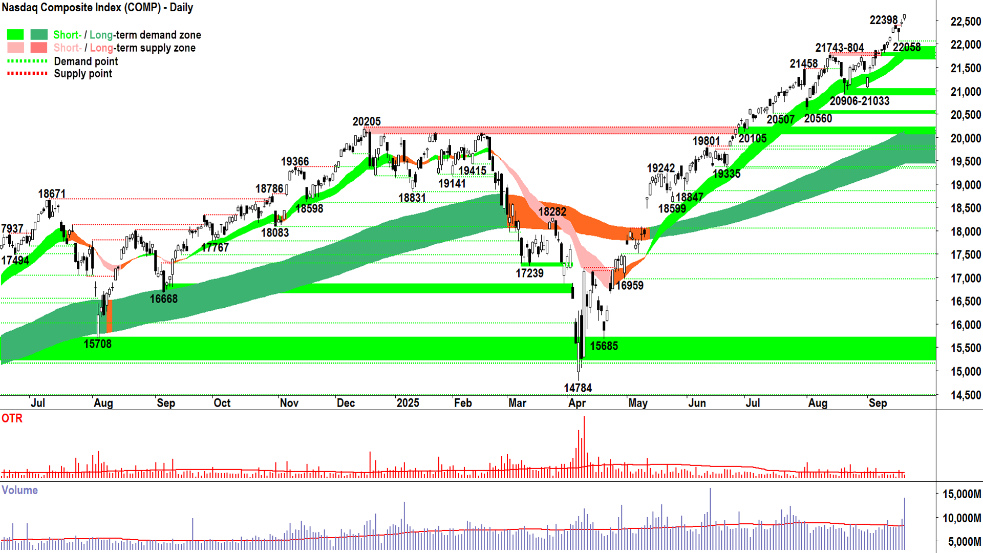
What a fantastic candle to be launching ChartWatch Markets on – the perfect picture of excess demand!
For those who might be interacting with my style of analysis for the first time, well here's a Primer that will help get you up to speed – but it's essentially very, very, (very x 💯!) simple:
D + S = P
More practically for us as traders:
"EXCESS DEMAND": D > S = P⬆️ >> This means that more often than not ("MOTN") the price will rise 📈
"EQUILIBRIUM": D = S = P➡️ >> This means that MOTN the price will move sideways / stagnate ⚖️
"EXCESS SUPPLY": S > D = P⬇️ >> This means that MOTN the price will fall 📉
We need some tools to help us determine when the demand-supply environment is in a state of excess demand, excess supply, or equilibrium – and how great the imbalance likely is in the first two instances.
My primary tools to accomplish this goal are:
My short and long term trend ribbons: Up / down is pretty self explanatory, widening is getting stronger vs contracting is getting weaker, but most importantly, each should act as a zone of dynamic excess demand in an uptrend and a zone of dynamic excess supply in a downtrend (see the Primer for more information on this concept).
Price action, i.e., the relative position of peaks (points of supply) and troughs (points of demand). In a strong demand-side market, we should see supply removal and demand reinforcement (i.e., rising peaks and rising troughs) vs in a strong supply-side market we should see demand removal and supply reinforcement (i.e., falling peaks and falling troughs).
Candles, or Japanese Candlesticks as they are more widely known. Demand-side control is consistent with white-bodied candles and or downward pointing shadows vs supply-side control is consistent with black-bodied candles and or upward pointing shadows.
That's it. No fancy indicators, no Fibonacci retracements, pivot points, or wave counting... 👎
I think anyone that's been reading my work for long enough has seen that this simple approach is very effective. After all, even the most complicated system must bow down to the most basic rule of economics: Good old D + S = P!
So, back to the Comp's chart. I mentioned it's a "perfect picture of excess demand". This can only mean one thing for me: As a trend follower, I want to allocate some risk here. How much depends on what individual stock setups I might find on the Comp's constituents, but more broadly speaking, it's defined by my personal capital allocation model.
This involves limiting the amount of capital I can risk on a market based on whether the demand-side or the supply-side (or neither) appears to be in control of the Comp's price. This might be fully invested, or "full risk position" "FRP" if the Comp's technicals are as good as they are now (i.e., a "perfect picture of excess demand"), or less so if my technicals indicate more of an equilibrium between demand and supply, or perhaps even very little if they are indicating supply-side control (so, I might be "2/3RP", "1/2RP", or as little as "1/3RP").
That's the way I do it, you of course can do it any which way you please – my goal is simply to help you understand some of the jargon I regularly use here. And on that note, I think I can sum up the Comp's technicals very quickly now:
Total demand-side control = Trends (ST⬆️ & LT⬆️ + both acting as zones of dynamic excess demand ✅), price action (rising peaks & rising troughs 📈✅), and candles (⬜✅) all indicate pervasive excess demand
✅✅✅ = I prefer to stay the course here at FRP
Key levels: 22058 is the closest point of demand, the price should not close below here if the demand-side is in control of the Comp's price; a close below the short term uptrend ribbon (presently 21765-21935) will nullify the short term uptrend = ⚠️
Gold Futures (Front month, back-adjusted) COMEX
%20COMEX%20chart_22%20Sep.png)
Golden trend remains intact (click here for full size image)
I tend to cover charts that are showing strong signs of excess demand or excess supply. Otherwise, if they're stuck in the middle – then where's the urgency in covering them? 🤷
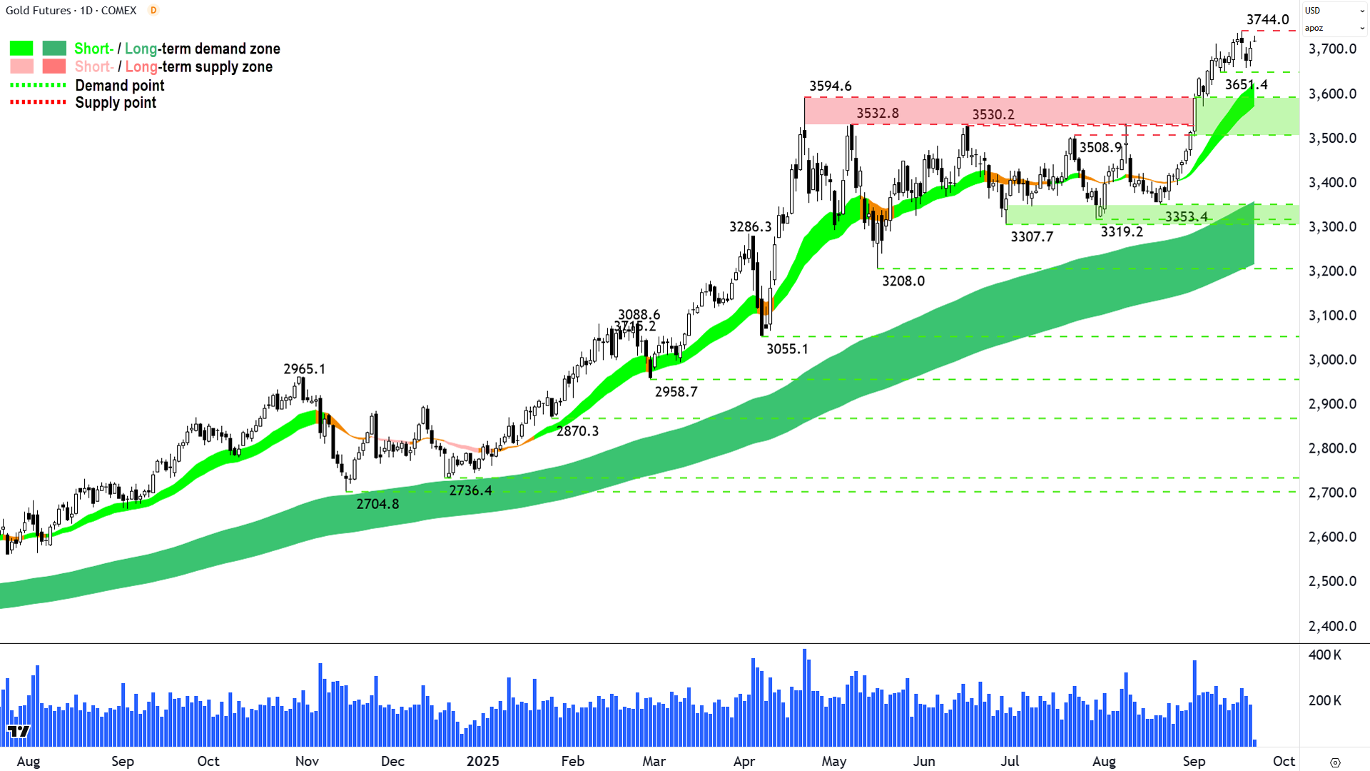
So, it makes sense that Gold is the next chart to cover after the "perfect picture of excess demand" of the Comp. Gold also deserves such a description, and therefore, similarly, I am happy to maintain a risk exposure here.
Now, if you're reading my analysis for the first time, the other key item to note is this:
I cannot tell the future. Not one bit. Sorry if this disappoints you! 🔮
Bummer, huh? 🫤
This means that if I say something like: "Ooh, ooh... that looks like a picture of excess demand... FRP!" then literally 10 seconds after you read that sentence, the price of whatever I'm referring to could implode and never go up again 💥.
It's a possibility. Anything is possible. Trends can and do change – and they can and do change very quickly. Often it's due to a significant news event – and the occurrence of such events is beyond my remit as a technical analyst!!!
So, please understand that I can only make my best call based upon the trends and associated probabilities as per the last candle shown on my charts. The next candle deserves the same scrutiny as the one I've just analysed – and it may change my view.
Hopefully, though, I've taught you enough in these articles so that you can make an informed decision on any development until you read my next analysis. 🧐
As for gold:
Short term uptrend and long term uptrend remain strong and intact, they are well established and both are acting as zones of dynamic excess demand ✅
Price action is rising peaks and rising troughs, but has compressed modestly since the break out of the 3594.6 major point of supply (I'm not reading too much into this, there's likely a little "digestion" of that strong break out move from 3353.4 required) ✅
Candles are predominantly demand-side in nature, indicating intraday buy the dip / pervasive programmed buy orders ✅
✅✅✅ = I prefer to stay the course here.
Key levels: 3594.6-3651.4 is the closest zone of demand, the price should not close below here if the demand-side is in control of gold's price; a close below the short term uptrend ribbon (presently 3575-3627) will nullify the short term uptrend = ⚠️
Silver Futures (Front month, back-adjusted) COMEX
%20COMEX%20chart_22%20Sep.png)
Silver in name, not necessarily in trend! (click here for full size image)
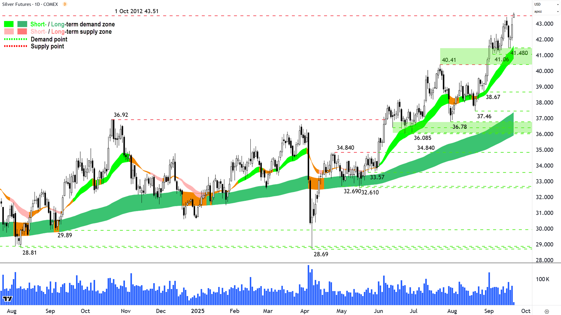
Please note that in some charts where trading can extend 24-hours, the last candle may be live – as is the case here for silver (it's also the case for gold).
I only ever analyse candles on an end-of-session basis. This means I discount live candles.
So, that last candle on the silver chart – as promising as it looks pipping the massive 1-Oct 2012 point of supply – is meaningless to me! It simply doesn't exist.
But everything else on silver's chart still looks pretty darn good – or more specifically – a "perfect picture of excess demand". There's that phrase again!
A break of the 2012 major point of supply looks likely, we can at least say that much – but I suggest it's significance is far less important than the bigger picture here:
Short term uptrend and long term uptrend remain strong and intact, they are well established and both are acting as zones of dynamic excess demand ✅
Price action is rising peaks and rising troughs, still decent separation, indicating motivated excess demand ✅
Candles are predominantly demand-side in nature indicating intraday buy the dip / pervasive programmed buy orders ✅
✅✅✅ = I prefer to stay the course here.
Key levels: 40.41-41.48 is the closest zone of demand, the price should not close below here if the demand-side is in control of silver's price; a close below the short term uptrend ribbon (presently 40.85-41.60) will nullify the short term uptrend = ⚠️
Uranium Futures (Front month, back-adjusted) COMEX
%20COMEX%20chart_19%20Sep.png)
More and more likely a new bull trend is commencing (click here for full size image)
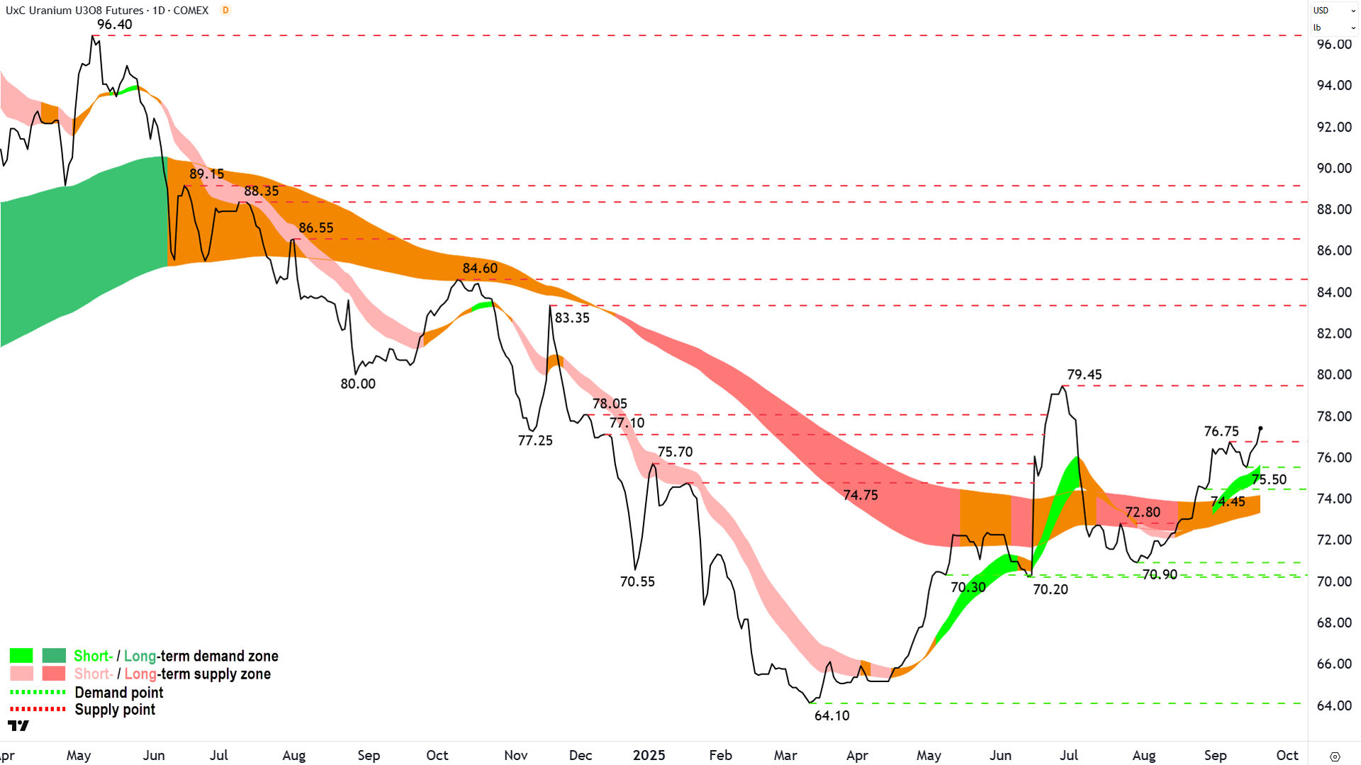
The last few times we've covered uranium in ChartWatch, we've noted the improving technicals with respect to growing demand-side control of its price.
The short term uptrend is growing in stature, and importantly, it appears to be acting as a zone of dynamic excess demand. The long term trend is neutral, but is slowly contracting – potentially towards a transition to an uptrend. There are now several troughs above the long term uptrend, allowing the assumption that it too is now acting as a zone of dynamic excess demand.
The last point is important considering my criteria for calling a new bull market phase:
The short term trend is up and the short term trend ribbon is acting as a zone of excess demand
The long term trend ribbon is neutral or up (i.e., not down)
The price is above the long term uptrend ribbon and the long term trend ribbon is acting as a zone of excess demand
The price action is rising peaks and rising troughs
There is a predominance of demand-side candles (note: not relevant for uranium)
I do think things are improving here, and I'm happy to make a "tentative" call that a new bull market is in place (yes, yes, that's not a cop out let me explain!).
I would however, feel more comfortable with such a call on a close above the 79.45 major point of supply. That was the last time uranium looked good enough to contemplate a bull market transition call – but then it flamed out nearly as quickly as it begun!
I propose a close above the trepidation that level coincided with – would put a new bull market in uranium call beyond reasonable doubt. In the meantime, I remain happy to ride the developing / improving trends here, strategically adding risk exposure on a case by case basis to uranium equities in anticipation of that "big call"! 🤞
ChartWatch *LIVE* Webinar
ChartWatch *LIVE* Webinars – WEEKLY Wednesday's @ 12pm AEDT
Learn more about technical analysis and trend following through real case studies on ASX stocks. Australia's premier technical analyst, Carl Capolingua, shares his unique insights on stocks as requested by viewers. Ask about a company in your portfolio or anything related to trading and investing and get Carl's expert opinion.
Places are limited so >REGISTER NOW!<