ChartWatch Markets: Did we just see the top of the gold and silver bull markets? "Sinister" candle signals major warning
Technical analysis of the most important global stock indices, commodities, bonds, FX, and crypto impacting your ASX portfolio each day.

Source: Shutterstock
Mentioned
KEY POINTS
- Gold and silver have been two of the best performing global assets over the last 12-months, with gold making repeated record highs and silver trading at multi-decade highs.
- ASX gold and silver stocks like Newmont Mining (NEM), Northern Star Resources (NST), Evolution Mining (EVN) and Boab Metals (BML) have enjoyed massive share price gains.
- An important development occurred in the charts of gold and silver on Thursday as each suffered a sharp reversal on massive volume. We investigate if this price action signals the potential end of these incredible bull markets.
In today's edition of ChartWatch Markets, we'll be covering the technicals for:
1️⃣ Nasdaq Composite
2️⃣ Gold Futures (Front month, back-adjusted) COMEX
3️⃣ Silver Futures (Front month, back-adjusted) COMEX
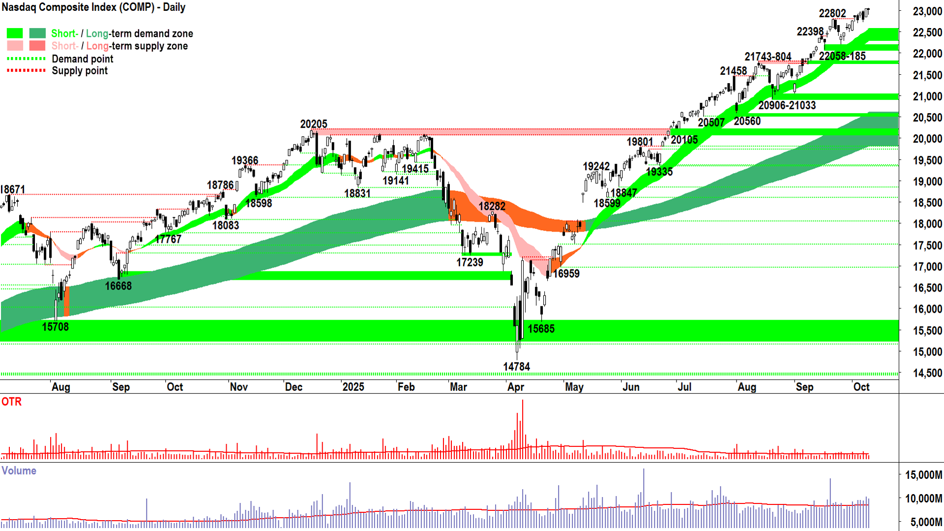
Nasdaq Composite Index

Nasdaq Composite Index chart (click here for full size image)
Pop.
Pop. Pop.
Pop. Pop. Pop. Pop.
What’s that? POP POP!
That’s POP the POP sound of POP POP value investors’ brains exploding right now POP POP POP! 💥
It must be hard being a value investor in a rampaging bull market. I wouldn’t wish that fate on anyone!
But that was me many, many years ago. Complaining that stocks where overvalued and that the market had gone crazy – and that it was bound to end in tears any minute now.
You see, the bull market before that, and the one before that, I was long to the teeth at the top and oblivious to the risks. Just like everyone else.
Then I got roasted, toasted, sliced and diced when the market crashed. Just like everyone else.
So, sure enough, in the next bull market, I went: “Not this little black duck… Nope, not this time… I’m not going to fall for that trick… Nope stocks are too expensive… I won’t be the one to buy at the top!”.
You know – that bull market experience – the one that if you’re in this game long enough you eventually go through (maybe you’re going through it right now! 🤔).
All of a sudden, you become a value investor. “Nope, I won’t pay up for that… the market is stupid, it’s lost the plot… the CRASH is coming soooonnnnnnn!!!!”
I can tell you that on one particular bull market like this, I even went short: “It can’t keep going up like this, I know, I’ll show the market… I’m going to profit from everyone else’s stupidity… see how clever I am!”.
Of course, the bull market didn’t give two hoots about me and what I thought. So, it disrespectfully rolled on. “Ha! I’ll show you!” I said… and I got shorter… “It’s even closer to a crash because it’s gone up more!”.
And I got shorter.
And shorter.
Until POP! 💥
No, the market didn’t crash. I just ran out of money ☹️.
Then, about 3 months later, the market did crash. That was the GFC.
See – I WAS RIGHT!
But broke 👎.
That, thankfully, was the last time I went against a bull market. It was the event in my investing journey that sealed the deal for me. I committed to a 100% technical approach – a 100% trend following approach.
And I have never strayed since from this commitment.
And I tell you what… I’m far more fun at parties during bull markets now (although terrible company during a bear market because I’m generally short to the back teeth and everyone else is lamenting their portfolios going up in smoke! 💨).
POP. Yes, those value investor brains are still popping because despite any bearish narrative they've thrown at the Comp chart above, it’s remains a picture of excess demand.
As trend followers, we don’t care why, we’ll leave that to the value investors to debate – simply that D > S = P⬆️.
And we know that More Often Than Not, when we see this, the best thing to do is maintain or add risk.
Of course, there are technical signals that help us gauge the strength of D > S so that we can skew that MOTN metric even further in our favour. Here, I note for the Comp chart:
✅ Short and long term trend ribbons: ⬆️ / ⬆️, widening (strengthening), each is acting as a zone of dynamic excess demand = Consistent with demand-side control.
✅ Price action: Rising peaks and rising troughs (i.e., supply removal and demand reinforcement) = Consistent with demand-side control.
✅ Candles: Predominantly demand-side in nature (i.e., white-bodied candles and or downward pointing shadows) = Consistent with demand-side control.
Last night’s candle shows the Comp was down slightly on the day – but this fact is meaningless to us. We’re more interested in its downward pointing shadow. We know this signals buy the dip activity – which is consistent with demand-side control. Indeed, all the Comp's technicals indicate demand-side control... and so...
I prefer to stay the course here at FRP (Full Risk Position = My personal allowable capital allocation limit for my investments in US stocks is 100%).
(Heck, we both know this trend is going to change at some point, and meh – we'll deal with that then... because when it does change, we'll see it in how demand and supply manifest themselves in the trends, price action, and candles 💪.
Key levels: 22058-185 is the closest zone of demand, the price should not close below here if the demand-side is in control of the Comp's price; alternatively, a close below the short term uptrend ribbon (presently 22290-22565) will also nullify the short term uptrend = ⚠️
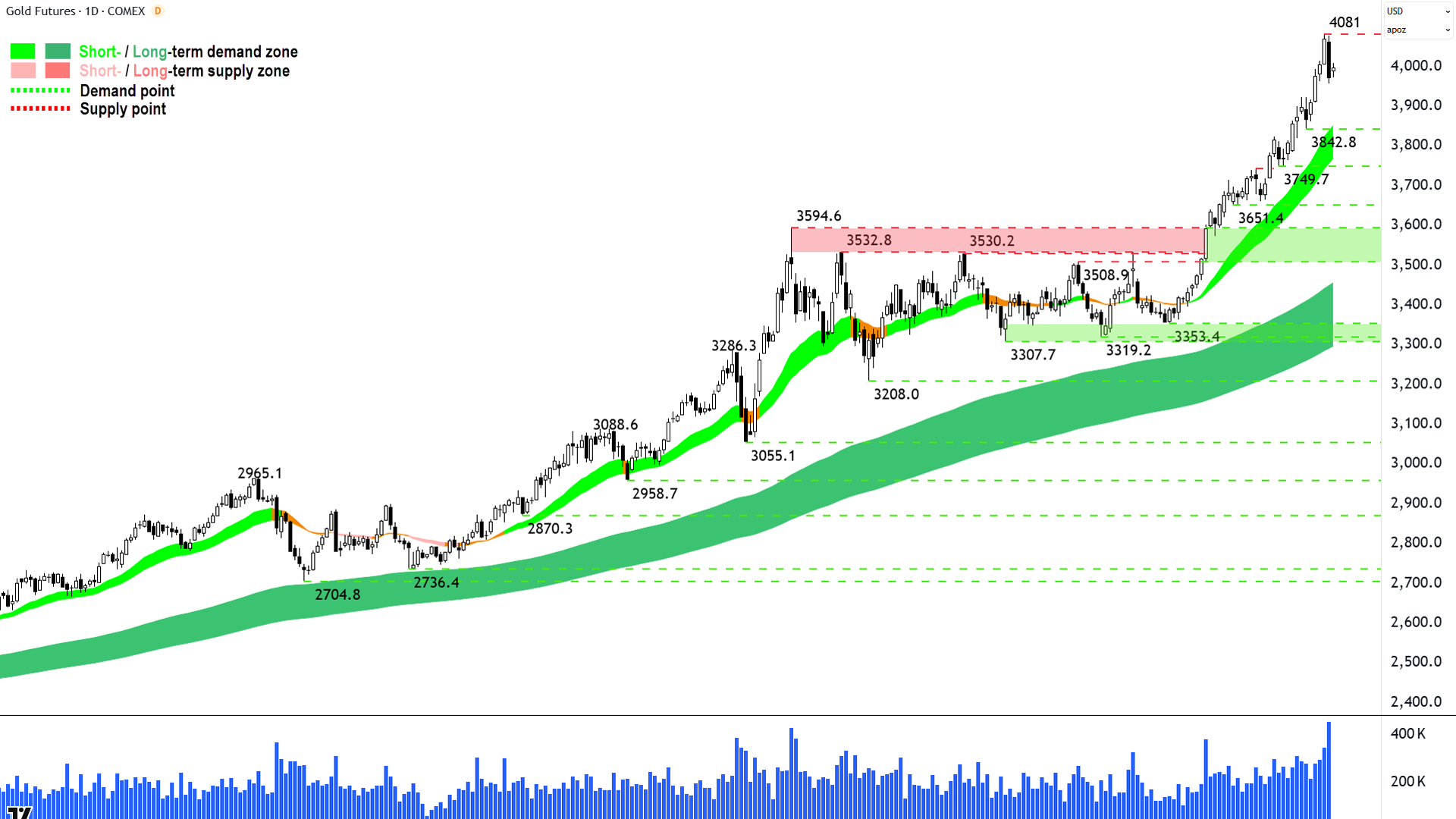
Gold Futures (Front month, back-adjusted) COMEX
%20COMEX%20chart_10%20Oct.png)
We have found supply (click here for full size image)
I wouldn’t usually cover a market twice in a week (apart from the Comp, of course!), but if there’s a candle that I think needs to be brought to your attention – then why would I wait until next week!?
And I think there’s a candle here, and in silver below, that needs to be brought to your attention📢.
Oohh… that sounds ominous! ⚠️
It’s not that bad, but “we’ve found supply” on gold and silver.
That’s the phrase I chime in my head when I see a candle like Thursday’s in a long uptrend (i.e., second from last on the chart above because the last candle is the live, Friday candle – discount it!).
Black + long + closing near the session low = Excess supply + motived + sustained into the close (indicates there’s likely more to go).
That’s it! That’s the end of the gold bull market! It’s all over! Sell everything!!! 😱
Nope! It’s not that significant a supply-side candle. Not by any measure – but you never know – it could be the seed of the next bear market. We don’t know of course, nor as trend followers – do we care.
If Thursday’s candle is the beginning of the next bear market, so be it, we’ll get the requisite signals to reduce our risk in due course. Be patient, let the process play out.
For now, “we’ve found supply”. Quite a bit of supply if we look at that massive volume bar (lots of supply hit lots of demand on the way down).
But one must consider all the other stuff on the above chart that suggests there’s also plenty of demand around too (short and long erm uptrends, still-intact price action, still-predominance of demand-side candles). This means the demand-side on gold has a very strong track record of buying the dip – which is what bull markets are all about.
So, we note that "we’ve found supply", which means we’re on alert for candles (i.e., more black bodies and or upward pointing shadows – the longer the more sinister), and price action (i.e., a lower peak to 4081 or a close below 3842.8) to warn us of growing supply-side control.
3842.8 and the dynamic demand of the short term uptrend ribbon (presently 3770-3855) is the most logical point the demand-side will aim to buy the dip with force. If they do – hunky dory – the gold bull market is strong and MOTN to continue. If they don’t – then it’s just as straight forward = Manage our risk.
For now, though, one super interesting and “a bit of a shot across the bow” candle doesn’t constitute a bear market. It doesn’t even constitute a risk management event for me. But I am now operating at an elevated state of awareness here because for the first time since 3353.4… “We’ve found supply”!
Key levels: 3842.88 is the closest zone of demand, the price should not close below here if the demand-side is in control of gold's price; alternatively, a close below the short term uptrend ribbon (presently 3770-3855) will also nullify the short term uptrend = ⚠️
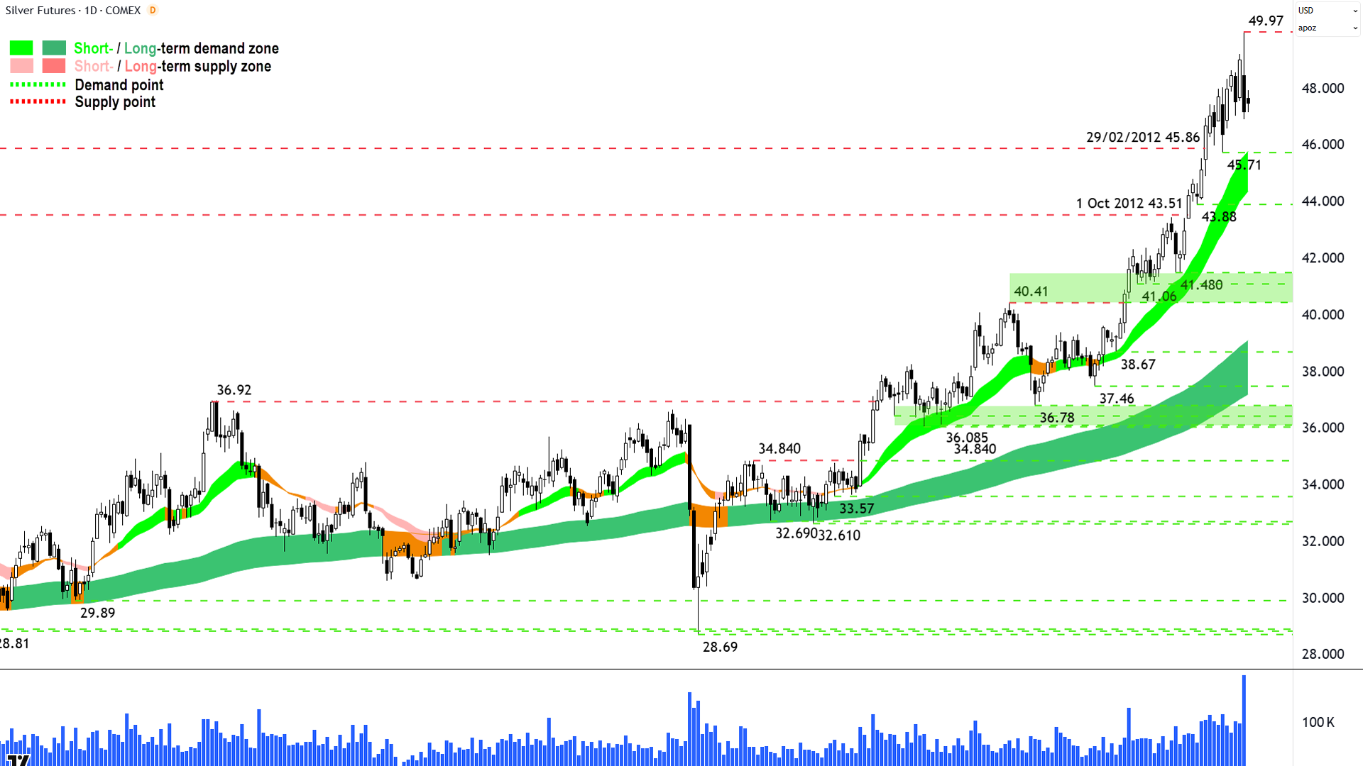
Silver Futures (Front month, back-adjusted) COMEX
%20COMEX%20chart_10%20Oct.png)
We have found supply (click here for full size image)
If gold’s Thursday candle implies “we’ve found a bit of supply”, then silver’s implies “we’ve found quite a bit of supply” ⚠️.
More supply, and more sinister supply, I suggest…
I don’t like that long upward pointing shadow because:
1️⃣ It indicates sell the rally activity – synonymous with supply-side control
2️⃣ The only way you can get an upward pointing shadow is if there was an initial move higher, in this case further into bull market territory. The subsequent selling just put a bunch of Johnnies-come-lately into a losing position. They won’t like that and they’ll want to undo their mistakes on any rally back towards their breakeven point – which sits around 48 and above.
And that means latent supply lurking anywhere above 48. Looking at the massive volume (gold too also had a substantial volume pulse), we can say that there’s a massive quantity JCL cash stuck in at that top – which means a great deal of latent supply – and there was a massive quantity active supply that gave it to them.
Lots of active supply + Lots of latent supply = ⚠️.
That’s the supply-side explained. What about the demand-side? 🤔
Well, if you have cash, then you’re part of the demand-side: How do you feel after seeing Thursday’s candle?
Motivated to demand-much? 🤷
Nope, I didn’t think so! You’re sitting back and reassessing your risk levels and withholding further cash until you’ve seen an emphatic confirmation that the supply-side is exhausted and or the demand-side is back in control.
We are very likely to experience a short term demand vacuum here. Balance that against suddenly elevated levels of supply…
So, for me, Thursday’s candle on silver sits in the “more sinister” camp compared to gold’s. Which means I think silver has a greater wall to climb in terms of re-establishing its short term uptrend.
I’m still not at manage my risk stage just yet, but I am far closer here than gold. As in, one more supply-side candle and I wouldn’t be comfortable holding a full risk position (because I wouldn’t be totally confident that the demand-side is still in control of silver’s price).
45.71 and the short term uptrend ribbon (presently 44.35-45.75) are the most logical points of next interaction with the demand-side. We will want to see aggressive buy the dip activity there – so long white-bodied candles and or long downward pointing shadows.
If we do, ditto gold hunky dory scenario / silver bull market is still intact. If we don’t, then something substantially more sinister is up here. Either way, we’ll cross that bridge when we get there.
Key levels: 45.71 is the closest zone of demand, the price should not close below here if the demand-side is in control of silver's price; alternatively, a close below the short term uptrend ribbon (presently 44.35-45.75) will also nullify the short term uptrend = ⚠️
ChartWatch *LIVE* Webinar
ChartWatch *LIVE* Webinars – WEEKLY Wednesday's @ 12pm AEDT
Learn more about technical analysis and trend following through real case studies on ASX stocks. Australia's premier technical analyst, Carl Capolingua, shares his unique insights on stocks as requested by viewers. Ask about a company in your portfolio or anything related to trading and investing and get Carl's expert opinion.
Places are limited so >REGISTER NOW!<
