Wipe those tears investors! A look at the brighter side of Trump’s Trade War crash
No point crying about it. Nope, time for a little fun and perhaps even a little insight into how market calamities develop in the charts.


Source: Shutterstock, Market Index
KEY POINTS
- As the ASX 200 tumbles, it’s time to review if there were any critical warning signs that all wasn’t well with global stock markets – and if investors could have reduced their risk in advance?
- The chart of a key US benchmark index showed a very similar pattern this time around to that experienced during several other stock market crashes.
- We investigate the concept of technical analysis, and how one might have used it to avoid potentially large losses during the current downturn.
It’s that kind of day 📉.
No point crying about it. Nope! Time for a little fun and perhaps even a little insight into how market calamities develop in the charts.
Ooohhh, charts... Tea leaf reading. Bogus. Random guessing game. Nothing but squiggly lines on a computer screen. A big, steaming pile of hooey!
Or at least that’s what the dyed in the wool, worship at the altar of Warren Buffett fundamental analysts will have you believe!
If you’ve seen my work before, you probably know that I’m a technical analyst. You probably already know that I love my trend ribbons, my price action, and most of all, my Japanese candlesticks (not the ornamental ones you bought on that last ski trip to Niseko).
So, for me, technical analysis is gospel. It’s all I need to analyse anything from stocks to crypto. And unlike my hard-core fundamentalist counterparts, I have no chip on my shoulder about the work they do 😁.
I can’t, because I need these learned and diligent guys and gals to do the hard work, the nitty-gritty research into a stock’s operations, cash flows, coverage ratios, balance sheet strength, management, strategy etc. etc. etc. to decide if it’s worth buying or worth selling.
You see, it’s these very tireless and vital cogs in the great financial machine that create the demand and supply for the stocks I then do my technical analysis on. As we must all agree (fundamentals, technicals, or otherwise): Demand plus supply equals price.
LONG LIVE FUNDAMENTALS, I say 📣!
Calamities, crashes…and…candles 🕯️!
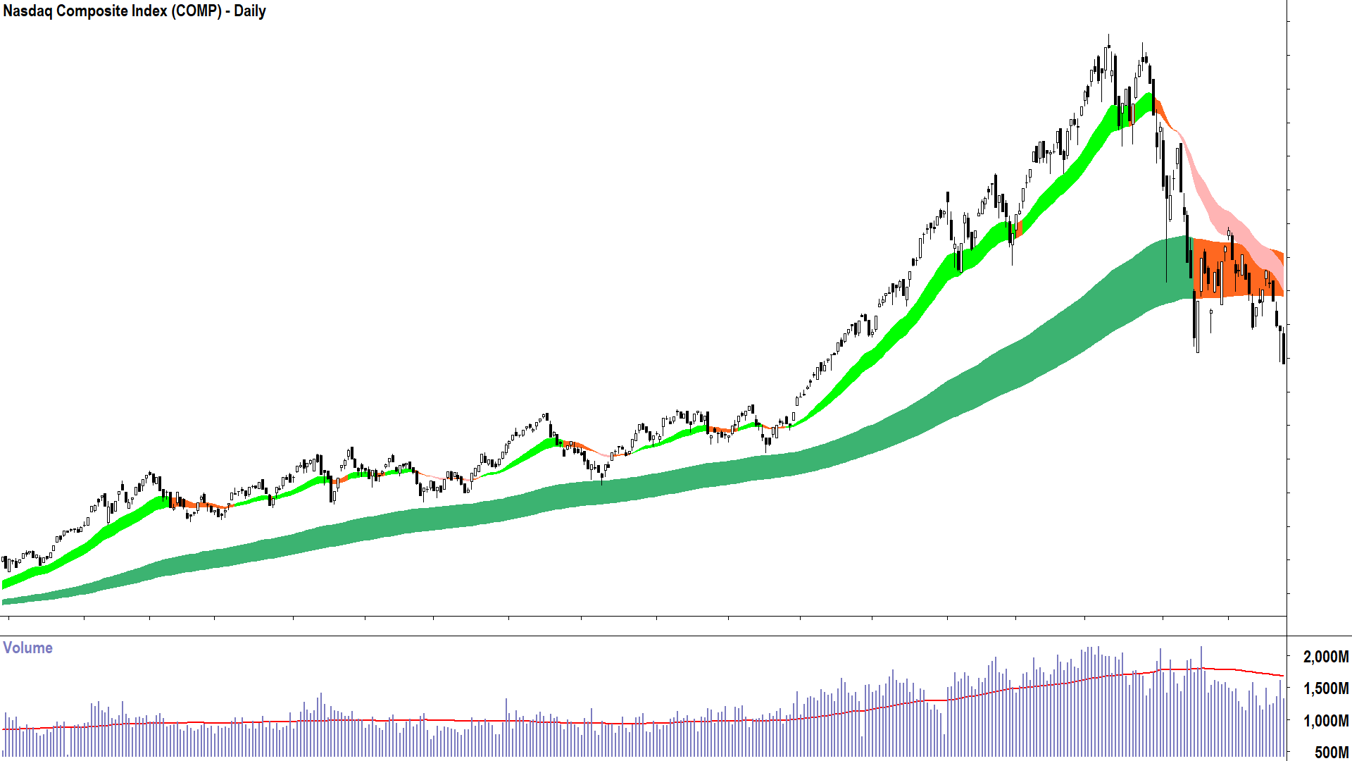
I really couldn’t have done much more to prepare you for this current downturn in my regular ChartWatch segment of our Market Index Evening Wraps. Each evening since that fateful market peak on Valentine’s Day a couple of months ago, I’ve updated you on the state of the major US and local market indices and bonds.
The rot set in slowly at first, but then quickly accelerated. There were several warning signs, however, based on my technical model. I’ll let you read the Primer for more information on how it works, but I note with respect to our hands-down favourite chart in ChartWatch, the Nasdaq Composite – these signals were duly noted:
The price action turned to falling peaks and falling troughs (27-Feb)
The candles turned to predominantly supply-side in nature (i.e. black-bodied and or upward pointing shadows) (arguably also 27-Feb)
The short term trend turned to down (28-Feb)
The long term trend turned to neutral (4-Mar)
The price closed below the long term trend ribbon (10-Mar)
A peak formed below the long term trend ribbon (13-Mar)
The price was repelled from the short/long term trend ribbons perfectly with a supply-side candle (26-Mar)
Follow through supply-side confirmation that the short/long term trend ribbons are now acting as zones of dynamic supply (i.e., the final, critical determinant of a bear market) (27-Mar and 28-Mar)
The picture built gradually at first, but then quickly, that supply was increasing across market participants to increasingly meet the prevailing excess demand consistent with the prior bull market. Around 4-March, the technicals implied supply was roughly the same as demand (i.e., equilibrium), and then at that fateful candle of 26-March – that the Nasdaq Composite had moved to a state of excess supply.
Ordinarily, you’d expect me to accompany the above dates and signals with a chart. A picture tells a thousand words and all. But I have deliberately withheld it for an exercise below. For now, the practical upshot of those dates is that with each fateful step, one would ideally have reduced their exposure to stocks and increased their exposure to cash.
Trump 1.0, Trump 2.0, COVID-19, “Big Short”, Fed lift-off, Dot-com bubble burst!
Ok, now for the fun bit. Below I have 6 charts of the Nasdaq Composite showing the beginning of the last 5 of its bear markets and the present “not bear market yet”. I have deliberately removed the dates and the prices so you can’t tell which chart corresponds with which stock market calamity. The triggers for the 6 market downturns are/were:
Now – Trump Tariffs 2.0
-18.2% in 4 months
President Trump applies the most sweeping set of US import tariffs since the Great Depression (Hmmm…Great Depression…Coincidence 🤔?)
Note the current decline of 18.2% is within one bad day away from meeting the criteria for an official bear market – a decline of 20% or greater
2022 – Fed Rates Lift Off
-37.8% in 11 months
The Fed signalled it would end its ultra-low, ultra-accommodative interest rate policy and proceeded to rapidly hike interest rates to combat the post-pandemic inflation spike.
2020 – COVID-19 Pandemic
-32.6% in 1 month
Chaos, unprecedented upheaval in the global economy as it and we ground to a halt. Masks on, sanitiser out, sleeves rolled up, isolate, isolate, isolate 😷!
2018 – Trump Tariffs 1.0
-23.9% in 4 months
Then first-term President Trump imposed a range of import tariffs on Chinese goods, as well as ramped up protectionist policies on technology and foreign ownership of US assets by Chinese companies.
Hey – we can’t blame all of this one on President Trump, the Fed did also embark on an aggressive interest rate tightening cycle!
2007 – The “Big Short”
-55.8% in 17 months
As coined by the 2015 movie of the same name. Refers to the downturn that caused the Global Financial Crisis which included the collapse of several major global financial institutions, a US housing market collapse, millions losing their jobs, and trillions of public dollars in bail outs. Ouch!
2000 – Dot-Com Bubble Burst
-78.4% in 31 months
Ahhh the good times I had punting tech stocks from my brick of a mobile phone in between economics lectures at uni. When hapless ASX mining companies kicking over rocks in the desert on Monday, decided to become internet businesses on Tuesday. Sounds silly now, but it was usually good for a 100% gain on the day! More broadly, the unprecedented at the time bull market that preceded this crash was fuelled by a frenzy of optimism over booming adoption of the internet. Will we ever get another like this again!? Hmmm…AI 🤔?
The charts:

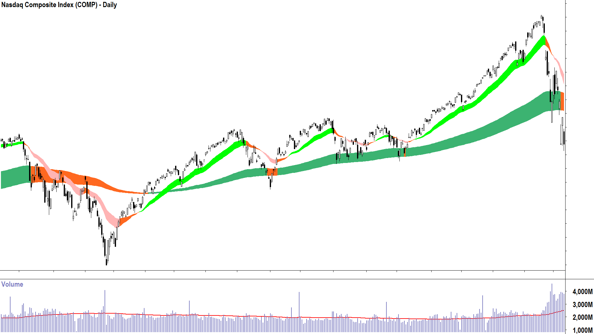
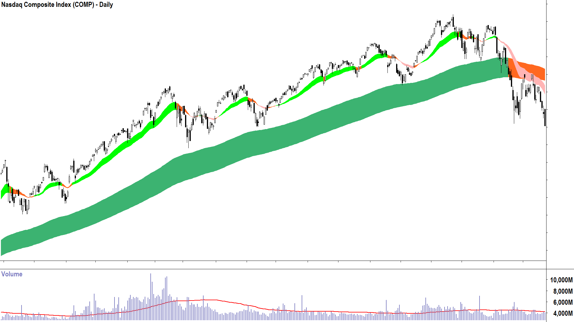
Mystery Chart 1 (click here for full size image)

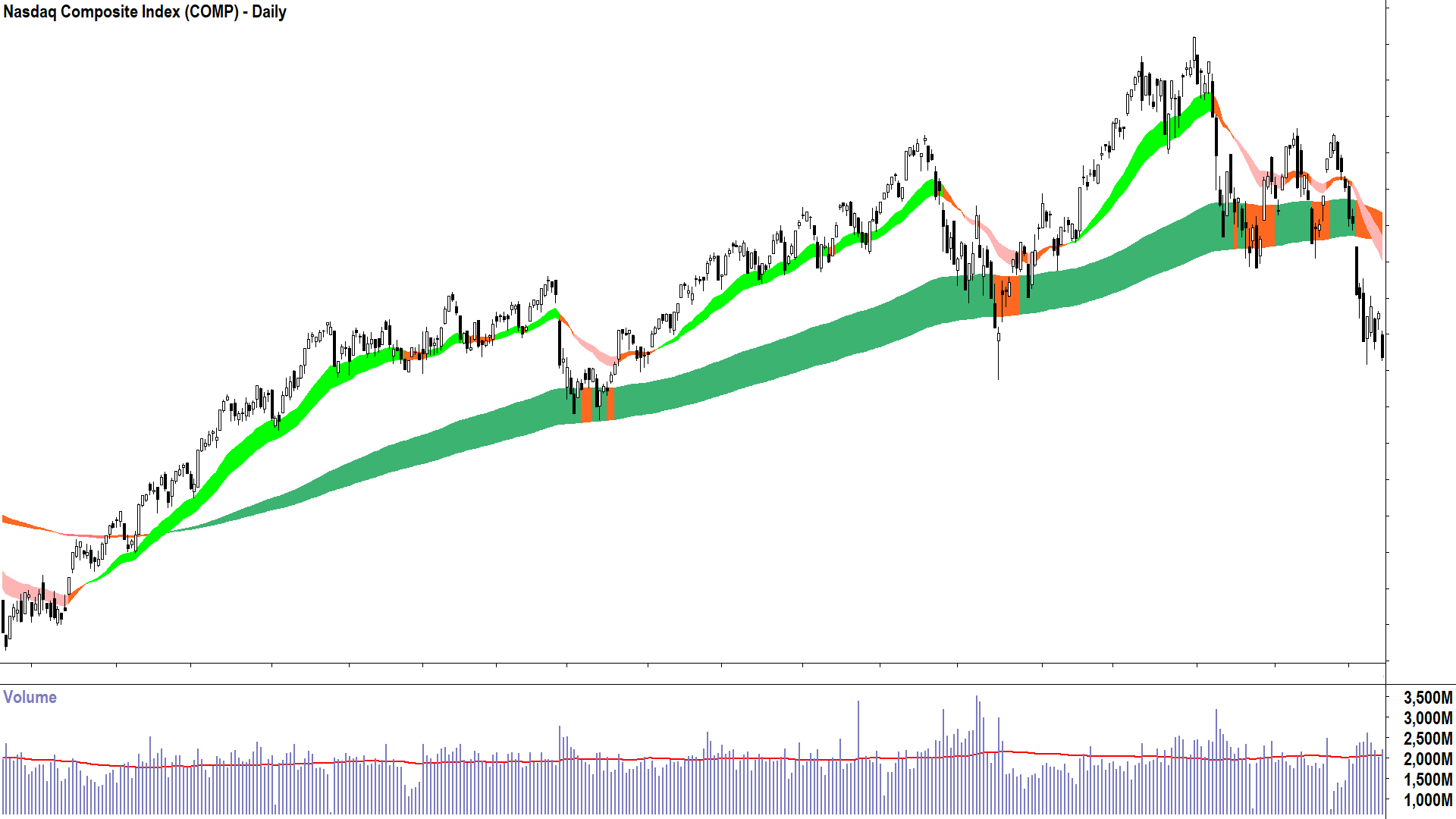
Mystery Chart 2 (click here for full size image)

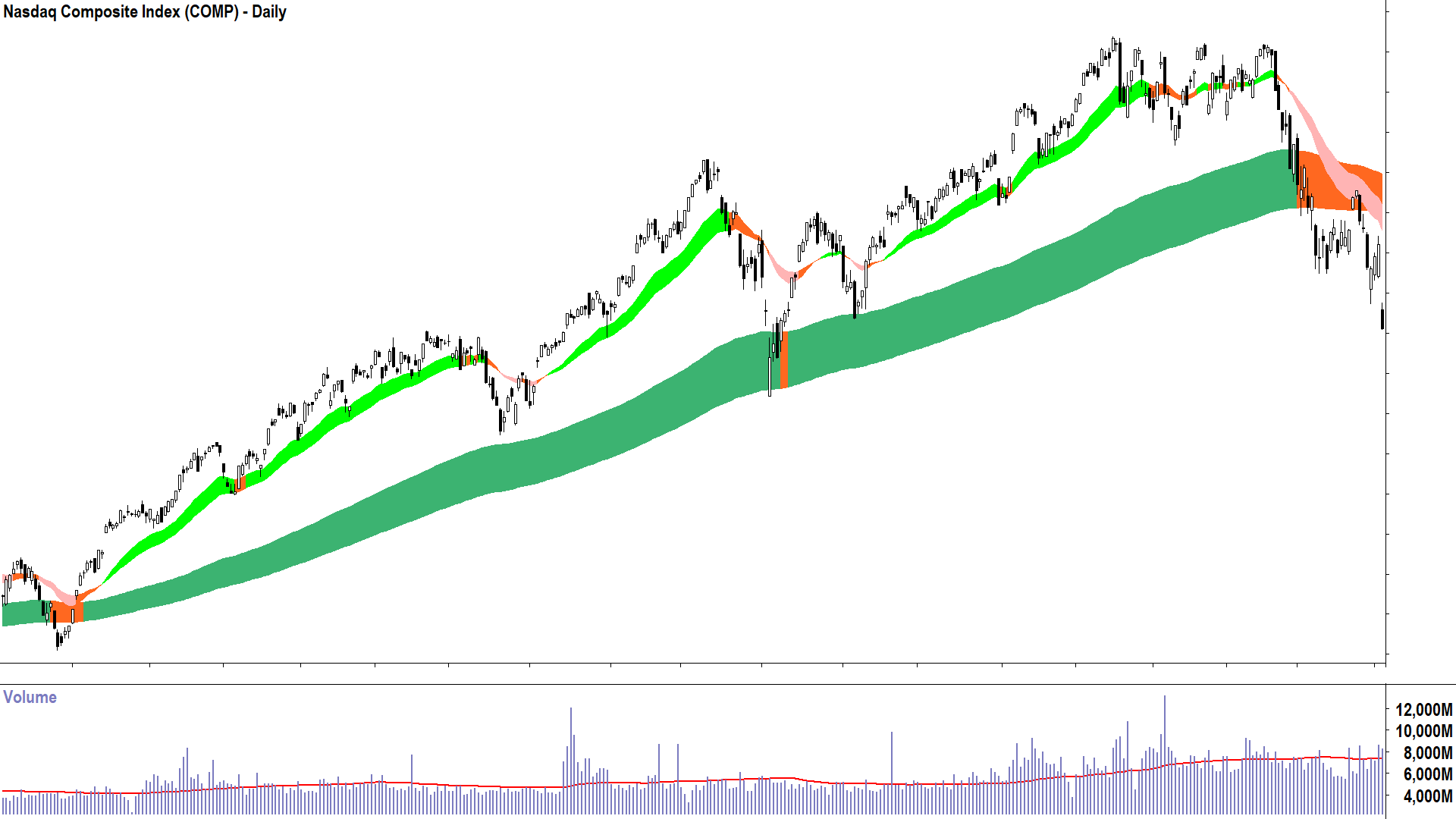
Mystery Chart 3 (click here for full size image)

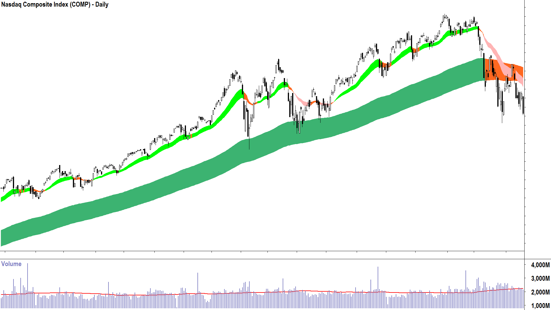
Mystery Chart 4 (click here for full size image)

Mystery Chart 5 (click here for full size image)

Mystery Chart 6 (click here for full size image)
Your task:
Can you match the Nasdaq Composite Mystery Chart with the start of its bear market?
Do you notice anything similar about the charts?
Repeat ❌ | Rhyme ✅
How did you go? Here’s the answer key:
Mystery Chart 1 = 2020 – COVID-19 Pandemic
Mystery Chart 2 = 2007 – The “Big Short”
Mystery Chart 3 = Now – Trump Tariffs 2.0
Mystery Chart 4 = 2018 – Trump Tariffs 1.0
Mystery Chart 5 = 2000 – Dot-Com Bubble Burst
Mystery Chart 6 = 2022 – Fed Rates Lift Off
Question 2 above was: “Do you notice anything similar about the charts?”
It’s a loaded question because I knew you would. They’re all just about the same – in fact, I would argue that the current market downturn in the Nasdaq Composite looks exactly like 2022, 2018, and 2001.
If each time the circumstances causing the particular market calamity were different – then how is it that market participants appeared to respond to in such a similar fashion?
Who would have thought it, the old saying “History doesn’t repeat but it sure does rhyme” seems to be true in the markets. Human nature, or at least human investing nature: the way we respond to risk and reward – has held largely consistent over time.
This is good news for technical analysts. Particularly those who can read the tell-tale signs of trend change. It’s also good news for you, because now you can keep an eye out for these consistent markers a bull market is coming to an end.
So, wipe those tears investors, the next bull market may be just around the corner!
