The ASX 200 just hit a new record high, but how long can the good times last?
With the Australian share market trading at a new record high, we look at fundamental and technical factors to see what might happen next.


Source: Shutterstock, Market Index
KEY POINTS
- Aussie shares are riding a wave of optimism over falling global interest rates and recent stimulus measures aimed at boosting the Chinese economy
- Many are concerned that rising share prices have pushed valuations of Aussie shares into “expensive” territory
- We investigate a number of key fundamental and technical indicators to try to determine whether investors should embrace record high share prices, or prepare for a correction
The financial media will no doubt be buzzing with headlines of another record high for the benchmark S&P/ASX 200 (XJO) today, as it traded above the 8,300 level for the first time. Today’s gain is part of a broader bull market that began all the way back at the COVID-19 pandemic lows in 2020 of 4,402.
It hasn’t been plain sailing since then, though it rarely is in the stock market. There have been two major corrections within the current XJO bull market. The first occurred between August 2021 and June 2022 when the XJO fell 16%, and the second occurred between February and November 2023 when it fell almost 11%.

It hasn’t been all plain sailing for the S&P/ASX 200 since the 2020 COVID-19 pandemic low
Despite the wobbles, for those that have stuck it out over the last four and a half years, the XJO is up an impressive 88.7%. It’s even better when you add back dividends, with the total gain swelling to 116%. This equates to a compound annual return since the current bull market began of 18.6% p.a. Compare this return to cash in the bank, or even property (1), and one would likely agree that Australian stocks have been a very good place to park your money so far this decade.
“So far”. That’s the key phrase here. Many fear investing in the stock market because those inevitable corrections can turn into crashes. To be fair, stock market crashes are very rare, with only a handful occurring in the last 100 years.
On the other hand, bear markets (2) are far more frequent, occurring roughly once every four years (ala the Olympics or the US Presidential Elections!). Bear markets tend to be relatively mild in terms of falls compared to bull market gains, though, and they usually play out much quicker than bull markets. Still, given the average bear market since 1990 wiped around one-third off stock prices – you certainly don’t want to get caught by one.
In this article, I'll investigate a number of key fundamental and technical indicators to try to determine whether investors should embrace these fresh record share price highs, or instead batten down and prepare for a correction.
Is the Australian stock market expensive?
Financial analysts often use the concept of a market price to earnings ratio (P/E Ratio) to understand whether a stock market is overvalued or not. To calculate the P/E Ratio, analysts will divide the amount of earnings expected to be earned by all companies over the next 12 months by the price of the benchmark index. As we typically prefer a higher rate of earnings to the price we must pay for those earnings, a lower P/E Ratio is preferred to a higher one.
This data on market P/E Ratios has been gathered over many decades (chart below) and can be summarised as:
Market P/E Ratios near 10 or below have typically been associated with major market lows and subsequent recoveries, i.e., you could say the market is “cheap”
Market P/E Ratios around 15 have typically been associated with a market that is considered “fairly valued”
Market P/E Ratios near or above 20 have typically been associated with major market tops and subsequent downturns, i.e., you could say the market is “expensive”

ASX 100 Price-to-earnings Ratio 12-month trailing earnings. Source: “Research Discussion Paper, A History of Australian Equities”, Thomas Mathews. Published by the Reserve Bank of Australia April 2019
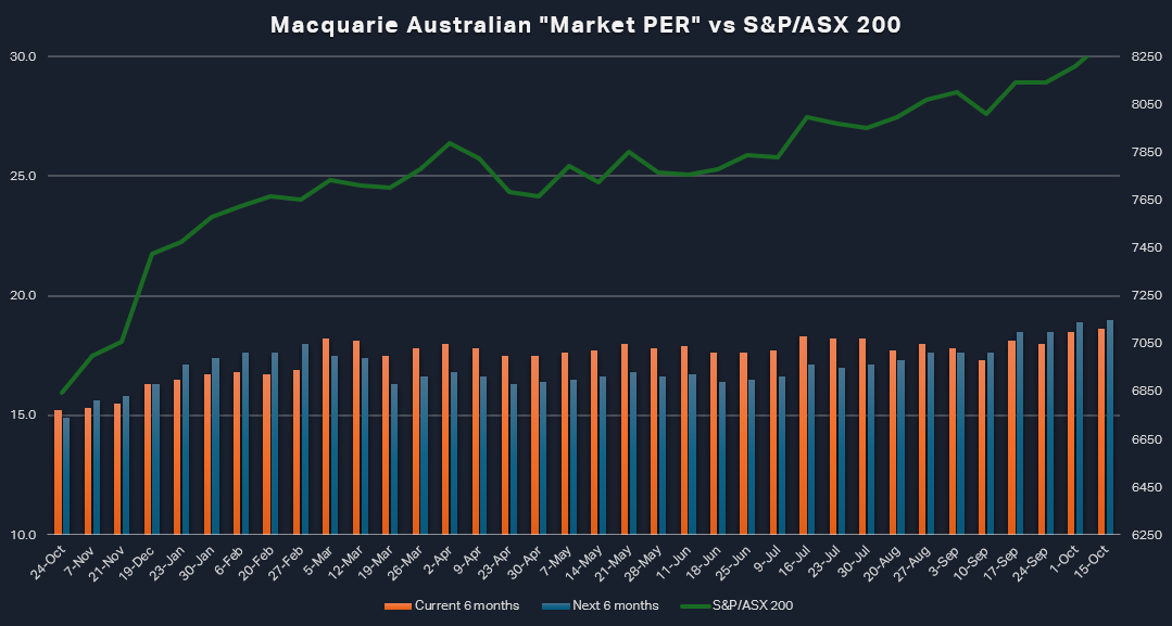
To answer the question of whether the Australian stock market is presently expensive or not, we will use Macquarie’s Australian Market PER. The major financial markets research house publishes this data each week for its clients (but we have access too!). The most recent update shows that the Australian Market PER for the fiscal half ending 31 December 2024 has increased to 18.6x from 17.8x one month ago. Looking ahead to the fiscal half ending 30 June 2025, the Australian Market PER has increased to 19.0x from 17.6x one month ago.
It’s important to note that we are using best practices here. We should always use forward looking P/E Ratios when conducting our analysis, and preferably sourced from a reputable analyst like Macquarie. Historical P/E Ratios do not consider earnings growth, and because earnings are typically growing (as the economy is typically growing and companies use new technologies to grow productivity), P/E Ratios in the future tend to be lower than in the past.
The bottom line is that Macquarie’s Australian Market PER is bad news for investors sitting on cash who are looking for a bargain entry into the Australian stock market. On the whole, Australian shares presently do not appear to be “cheap”, rather, they appear to be closer to what has historically been considered “expensive”.

Macquarie’ Australian Market PER Chart (3) (click here for full-size chart)
Keep in mind though, the Market PER is a dynamic concept, relying on two moving parts: Price and Earnings. The chart above shows how it has changed over the last 12 months as both expected earnings and the price of the XJO have changed. The Market PER is at its highest level in 12 months and the general trend appears to be up, meaning that prices have been increasing at a faster rate than Macquarie’s forecasted earnings.
A friendlier trend…
While we’re on the topic of trends, let’s switch gears from fundamental analysis to technical analysis. Technical analysis is the study of how the price of an asset changes over time, and inferring from those changes what the underlying state of the demand-supply environment is.
Technical analysts associate rising prices with a state of excess demand, that is, cash flowing into the asset is overwhelming the amount of securities of that asset available at lower prices. Falling prices are just the opposite, they are associated with a state of excess supply. Now, the amount of securities of an asset being made available at lower prices is overwhelming the cash seeking to purchase them.
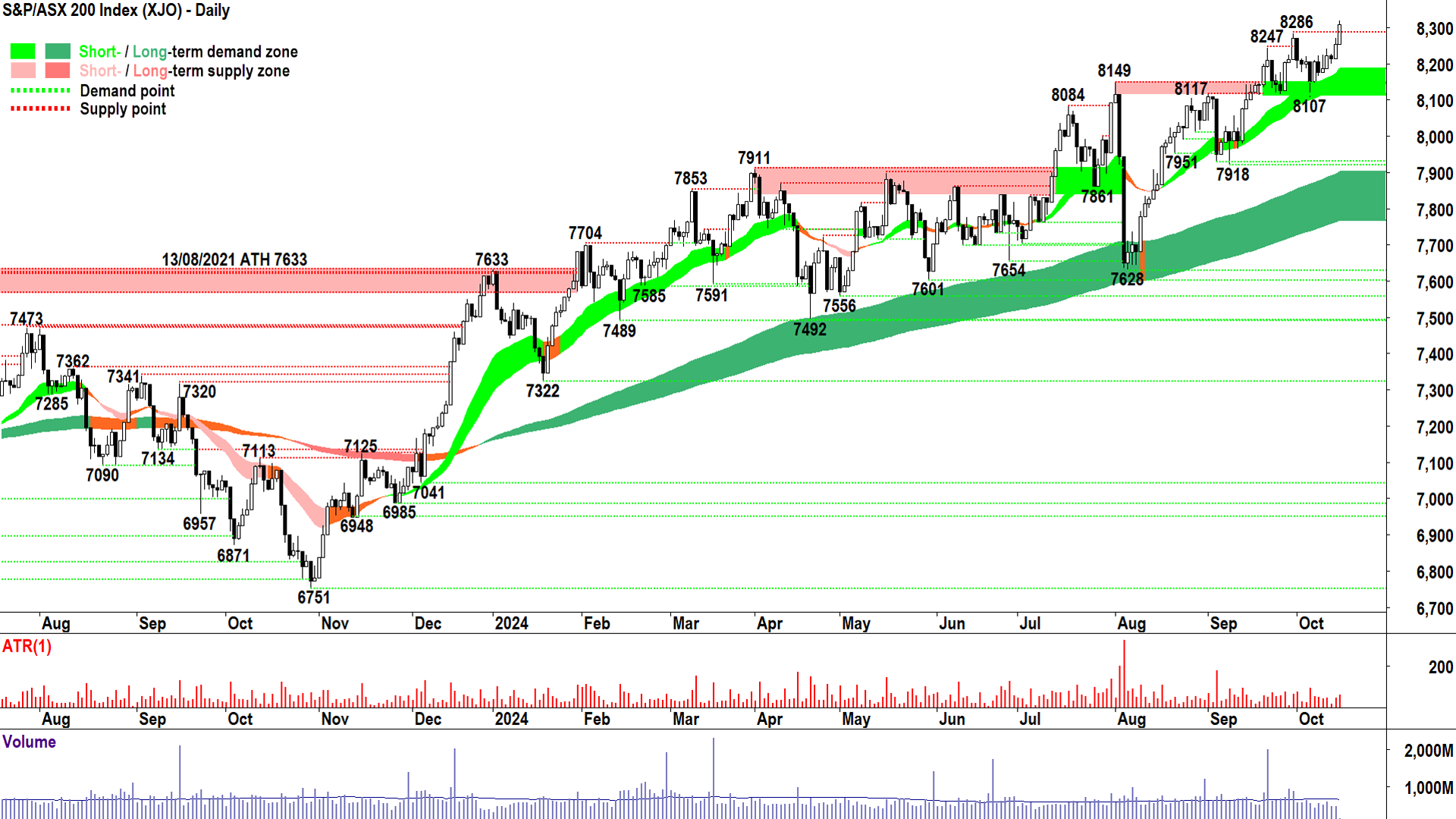
I conduct regular technical analysis on the XJO and on ASX listed stocks in my Evening Wrap and ChartWatch Scans editions I regularly publish on Market Index. Below is my standard technical analysis chart of the XJO that uses Japanese candlesticks and my proprietary trend ribbons.
%20chart%2015%20October%202024.png)
S&P/ASX 200 Technical Analysis chart (click here for full size image)
I always start with the short and long term trends. Both are rising (light green and dark green respectively), and importantly, both appear to be offering dynamic support to the price action. Dynamic support is a term I use to describe the price bouncing up and out of the trend ribbons. Rising trends and dynamic support are examples of healthy price action in a bull market, and both are consistent with an environment of strong excess demand.
I also note that within the price action, rising peaks and rising troughs are prevalent (troughs are rising on a closing price basis). This is consistent with supply removal and demand reinforcement, and both phenomena are consistent with a state of strong excess demand.
Finally, I can see a predominance of demand-side candles. These are candles that have white bodies and/or downward pointing shadows. A predominance of demand-side candles generally indicates pervasive programmed buying, and similarly, is therefore consistent with fund manager accumulation. Again, we have another indicator of a state of strong excess demand.
In conclusion, there is presently an absence of clear technical signals that indicate the supply side has very much control of the XJO price at all. While this continues to be the case, I can see no reason why the XJO cannot continue to rise in-line with prevailing trends, price action, and candles.
‘Tis the season to be jolly!
There’s another field of technical analysis called seasonal analysis. This involves studying how the price of an asset changes at particular times of the year. Seasonality in prices is most prevalent in agricultural commodities whose production is themselves highly seasonal, but it is also prevalent in stock prices.
When we look at the seasonality of the Australian stock market, as per the All Ordinaries Total Return Index (XAOA), we can see that we are embarking on a seasonally strong time of the year for Aussie shares.

All Ordinaries Total Return Index (XAOA) average monthly returns 30 years (click here for full size image)
Over the last 30 years, the XAOA delivered an average combined return of 3.8% in October to December. In terms of reliability, October has delivered a positive return 67% of the time over this period, November 63.3% of the time, and December an impressive 73.3% of the time. Whilst January tends to be a relatively quiet month, the gains can often continue unabated into the seasonal April peak (Hence the old saying: “Sell in May and go away!”).
In conclusion, whilst we must concede from the fundamentals the Australian share market isn’t currently trading in “cheap” territory, based on still-bullish technical and seasonal factors, you could be reading many more articles like this one with headlines of “ASX 200 hits a record high”.
1. I couldn’t find a corresponding annual return for Australian property since the pandemic, but I did find data from SQM Research that suggest Sydney house prices have risen by 7.7% p.a. over 3 years and by 5.0% p.a. over 7 years. Some might argue that property prices are also overvalued! 2. A correction is typically defined as a peak to trough decline of 10%, while a bear market is defined as a peak to trough decline of 20%. A crash has no formal definition, but it refers to a large fall in a very short period, and is usually associated with commencing a bear market. 3. Note that every six months, Macquarie must change the half it refers to as the current half and the half it refers to as the next half. In the above chart, there was a change on 5 March when the June 2024/December 2024 halves took over from the December 2023/June 2024 halves as the relevant current half/next half combination. The last change was on 10 September where December 2024/June 2025 transitioned to the relevant current half/next half combination. For this reason, you may notice what appears to be an abrupt change in the Market PER data.
